





Author: kblues

  • The Most Hated Fonts You Use Every Day (And Why Designers Wish You’d Stop)  

    The Most Hated Fonts You Use Every Day (And Why Designers Wish You’d Stop)  

    You’re building a website, refreshing pages or mocking up a design – and without a second thought, you reach for a familiar font. Arial. Tahoma. Times New Roman. Easy. Barely anyone gives it a second thought.  

    But here’s the thing: those everyday font choices are quietly working against you. At Kraam, our designers see the same fonts cropping up repeatedly, often chosen out of habit rather than intention. 

    It’s not that these fonts are obscure or gimmicky – it’s that they’re too familiar, regularly used without stopping to consider whether they’re actually doing the job they’re meant to do.  

    The Fonts Designers Love to Hate  

    To understand why certain styles cause so much frustration, our design team looked at a selection of widely used fonts through the same lens they use every day: how readable they are, how consistent they feel and how well they perform across modern screens and layouts.  

    Each font was assessed across several practical design considerations:  

    • Proportions – how balanced and readable the overall letter shapes are   
    • Stroke consistency – how controlled and consistent the line weight feels   
    • Apertures & spacing – how open and easy the characters are to read   
    • Distinguishability – how clearly similar characters can be told apart   
    • Structural consistency – how well the font works as a cohesive system  

    Each was scored out of 10 for every category (50 total). Here’s how the worst offenders stacked up.   

    1. Arial Narrow – Score: 30/50

    Arial Narrow, scoring the lowest of all, has one core issue; its compressed structure. The reduced character width pushes letters tightly together, limiting the natural spacing the eye relies on to scan text comfortably. That creates a visually cramped experience, especially across longer passages.   

    On a website, that compression becomes a usability problem. Users tend to scan rather than read in detail, and tightly packed text slows that process down. On smaller screens, the lack of spacing can cause characters to blur together, increasing effort and reducing clarity – both of which can impact engagement and time on page. 

    2. Microsoft Sans Serif – Score: 31/50

    Microsoft Sans Serif lacks refinement in its proportions and spacing, giving it a slightly unbalanced, utilitarian feel. It was designed for older system environments – and that legacy still shows today.   

    From a web perspective, this translates into a subtle but important issue – perceived quality. Even if the text is readable, the font can make a site feel dated or less polished. That perception can influence how users judge credibility, particularly on first impressions.  

    3. Century Gothic – Score: 32/50

    Century Gothic’s geometric design relies on near-perfect circles and uniform strokes, which reduces distinction between individual letterforms. This can make words feel visually repetitive and slightly harder to process quickly.  

    Its wide proportions also result in fewer words per line, increasing scroll depth and breaking reading flow, especially on mobile. What looks clean in isolation can become inefficient in real-world layouts.  

    4. Tahoma – Score: 33/50

    Tahoma features thick, sturdy letterforms and relatively tight spacing, which can create a dense, heavy appearance. While functional, it lacks the openness that supports comfortable reading over longer stretches of text.  

    On websites, this kind of density quickly becomes tiring – especially on content-heavy pages. When text blocks appear visually heavy, users are less likely to engage with them, making it harder to guide attention and establish clear content hierarchy.  

    5. Arial – Score: 34/50

    Arial’s neutral structure and minimal contrast make it highly versatile, but also visually unremarkable. It lacks the subtle characteristics that help guide the eye or create rhythm across text.  

    From a usability standpoint, it performs adequately – but doesn’t enhance the reading experience. On websites, this often results in content that feels generic. In competitive digital environments, that lack of distinction can impact both brand perception and user trust. 

    6. Trebuchet MS – Score: 35/50

    Trebuchet MS introduces more personality through its varied letterforms, but this comes at the cost of consistency. Some characters feel slightly exaggerated, which can interrupt the visual rhythm of text.  

    Over longer passages, this can subtly disrupt reading flow. While it remains readable, it’s less predictable than more modern sans-serif fonts – which can affect how smoothly users move through content on a page. 

    7. Times New Roman – Score: 36/50

    Times New Roman is optimised for print. Its high stroke contrast and tight spacing work well on paper – but not always on screens. 

    For users skimming content (which most people do), this creates friction. It can also feel out of place in modern UI design, where cleaner, simpler typography is expected.  

    8. Verdana – Score: 37/50

    Verdana’s generous spacing and large x-height give it excellent legibility. The downside? It takes up more space than necessary.  

    On a website, that inefficiency can impact layout. Fewer words fit within a given space, leading to longer pages and increased scrolling. While still readable, it’s less space-efficient than newer fonts designed specifically for modern displays. 

    9. Georgia – Score: 38/50

    Georgia offers a more refined serif structure, with solid proportions and reliable readability. However, its traditional design can feel slightly out of step with modern digital aesthetics.  

    On websites, this can affect how current or aligned a brand feels. While it performs well in editorial contexts, it’s not always the best choice for interfaces or conversion-focused pages where speed and clarity take priority.  

    10. Candara – Score: 39/50

    Candara features smooth curves and open spacing, which support a comfortable reading experience. Structurally, it avoids many of the issues seen in lower-ranked fonts.  

    However, it lacks strong defining characteristics. On a website, that means it won’t hinder usability, but it also won’t actively support hierarchy, emphasis, or brand identity. It performs adequately but doesn’t add much to the overall effectiveness of the design.  

    The Do’s and Don’ts of Website Typography  

    Across all ten fonts, the same themes kept cropping up, from cramped spacing and weak hierarchy to inconsistent proportions. Based on those patterns, a few practical typography rules stand out.  

    Do:  

    • Choose fonts designed for digital readability.   
    • Prioritise open spacing and clear letterforms.   
    • Maintain consistency across your site.   
    • Test typography across devices and screen sizes.   

    Don’t:  

    • Use condensed fonts for body text.  
    • Default to system fonts without considering brand identity.   
    • Overlook spacing, hierarchy, and structure.  
    • Mix too many conflicting styles. 

    Why this matters for your website  

    Individually, the flaws we’ve highlighted might seem minor but together, they shape how users experience your website – often subconsciously influencing whether they stay and trust your content or leave.   

    Typography isn’t just about how something looks. It’s about how it works.  

    As Kraam’s Senior Designer, Keith Blues, puts it: “Typography is one of the most important parts of digital design because it directly affects how people consume information.   

    “If text is hard to read or feels visually off, users won’t spend time figuring out why – they’ll just disengage.”  

    If you’re unsure whether your typography is helping or hurting your site, our team is on hand to help. Reach out via our contact page here.  

  • Multimodal UX: What is it and why does it matter? 

    Multimodal UX: What is it and why does it matter? 

    Multimodal UX: What is it and why does it matter? 

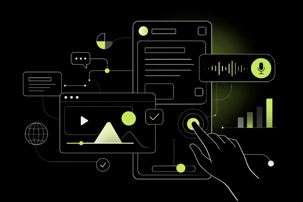
    As digital products evolve, users interact with technology in more ways than ever before. From voice commands and touch gestures to visual interfaces and haptic feedback, modern experiences rarely rely on a single interaction method. This shift has led to the rise of multimodal UX — a design approach that combines multiple interaction modes to create more flexible and intuitive user experiences. 

    In this guide, we explain what multimodal UX is, how multimodal interfaces work and where they appear in everyday technology. We also explore why multimodal UX matters for modern web design, the benefits and challenges of implementing it and best practices for creating effective multimodal experiences. 

    What is Multimodal UX? 

    Multimodal UX (User Experience) refers to designing digital experiences that support multiple forms of user interaction simultaneously or interchangeably.  

    Rather than forcing users to interact with an interface in one specific way, multimodal systems enable a combination of input and output methods. Typical interaction modes include: 

    User Inputs 

    • Voice commands 
    • Touch interactions 
    • Keyboard input 
    • Gesture controls 
    • Eye tracking or gaze 

    System Outputs 

    • Visual interfaces 
    • Audio feedback 
    • Haptic responses (vibration or touch feedback) 
    • Animations and motion 

    By combining these modes, designers can create experiences that feel more intuitive and adaptable to different contexts. 

    How multimodal interfaces work 

    Multimodal systems rely on technologies that interpret different types of user input and translate them into actions. These technologies often include: 

    Speech recognition systems 

    Used in voice assistants to interpret spoken commands. 

    Gesture detection 

    Sensors or cameras track hand movements and translate them into actions. 

    Touch interfaces 

    Touchscreens detect taps, swipes and multi-touch gestures. 

    Visual feedback systems 

    Interfaces display visual cues, animations or notifications in response to user actions. 

    When these technologies work together, users can switch seamlessly between interaction types. For example, a user might start a search using voice input and then refine it using touch navigation. 

    Multimodal UX vs traditional UX 

    Traditional digital interfaces typically rely on a single form of interaction. Multimodal UX expands this by offering multiple pathways for interaction. 

    Traditional UX Multimodal UX 
    Single interaction method Multiple interaction methods 
    Limited flexibility Context-aware experiences 
    Often device-specific Cross-device compatibility 
    Less adaptive More personalised interactions 

    This shift reflects how people naturally interact with technology today. Rather than using a single device or input method, users move fluidly between screens, voices and gestures. 

    Pros and cons of multimodal UX 

    Below are the pros, cons and considerations when making the switch to multimodal UX design. 

    Pros Cons 
    Improves accessibility by supporting different user needs and abilities Increases design and development complexity 
    Allows flexible interaction across different environments and contexts Requires more testing across multiple input methods 
    Enhances user engagement with richer, more dynamic experiences Risk of inconsistent behaviour between interaction modes 
    Supports cross-device and cross-platform experiences Can introduce performance issues (e.g. voice or gesture recognition errors) 
    Creates more intuitive and natural interactions May overwhelm users if too many options are presented 
    Future-proofs digital products as new interaction methods emerge Higher implementation and maintenance costs 

    Why multimodal UX matters in modern web design 

    As digital experiences become more complex, multimodal UX offers several key advantages. 

    Improved accessibility 

    Multimodal interfaces can make technology more accessible for users with different abilities. For example: 

    • Voice input can help users with mobility limitations 
    • Audio feedback assists visually impaired users 
    • Visual interfaces support users who prefer visual navigation 

    By supporting multiple interaction methods, designers can create more inclusive digital experiences. 

    Greater user flexibility 

    Users interact with technology in many different environments. Someone might: 

    • Use voice commands while driving 
    • Use touch gestures on mobile devices 
    • Use keyboard input on desktops 

    Multimodal UX allows users to switch between interaction modes depending on their context. 

    Enhanced user engagement 

    Rich and varied interactions can make digital experiences more engaging. Visual feedback, animations, voice responses and gesture interactions help create interfaces that feel dynamic rather than static. This can improve: 

    • User satisfaction 
    • Time spent on platforms 
    • Overall product usability 

    Cross-device experiences 

    Users increasingly move between devices throughout the day. Multimodal UX helps maintain consistency across: 

    • Mobile devices 
    • Desktop applications 
    • Wearable technology 
    • Smart speakers 

    Designing with multiple interaction modes in mind ensures smoother transitions between these platforms. 

    Build better digital experiences with Kraam 

    Designing effective digital products requires more than just attractive interfaces – it requires thoughtful user experience design and robust development.  

    At Kraam, we help businesses create modern websites and platforms through our design and development services, while ensuring long-term performance with reliable hosting and maintenance

    If you’re exploring ways to improve user experience or bring a new digital project to life, you can also explore more insights on the Kraam blog, or contact us to discuss your project. 

    Multimodal UX FAQs 

    Have more questions on multimodal UX? Find the answer to everything you need to know here: 

    What is a multimodal interface? 

    A multimodal interface is a system that allows users to interact using more than one input method, like voice, touch, gestures or text. These interfaces combine different modes to create a more flexible and intuitive user experience. 

    What is an example of multimodal UX? 

    A common example of multimodal UX is a smartphone assistant where users can speak a command, view results on screen and then interact further using touch. Another example is in-car systems that combine voice controls with physical buttons and visual displays.

    What are the benefits of multimodal UX?

    Multimodal UX improves accessibility, flexibility and engagement. It allows users to interact in ways that suit their environment or preferences, making digital experiences more inclusive and user-friendly.

    What is the difference between multimodal and omnichannel UX? 

    Multimodal UX focuses on how users interact with a system (voice, touch, gesture), while omnichannel UX focuses on delivering a consistent experience across multiple platforms or channels. The two often overlap but serve different purposes.

    Is multimodal UX important for accessibility? 

    Yes, multimodal UX plays a key role in accessibility. By supporting multiple interaction methods, it allows users with different abilities to choose the most suitable way to engage with a digital product.

  • Website redesign: How often should you do it?  

    Website redesign: How often should you do it?  

    Website redesign: How often should you do it?  

    A well-designed website strengthens your online presence, attracts customers and supports wider sales and marketing strategies.  

    Businesses need to keep their sites current and performing effectively to stay ahead of the competition. So, how often should a business redesign its website?  

    To learn what influences website redesign frequency and how to address it, read our blog.  

    Website redesign frequency 

    Web design experts and digital strategists often recommend a full website redesign every 2 to 5 years to reflect technological changes and evolving user expectations. 

    For B2B SaaS companies, the 2-3-year refresh guideline is especially relevant. Industry trends shift quickly, and what feels modern today can quickly seem outdated and lose its edge. 

    A website redesign can: 

    • Significantly boost your brand’s online presence and engagement 
    • Enhance functionality, navigation and UX (user experience)  
    • Showcase your position as industry leaders 
    • Help adapt to evolving consumer needs and technology 

    Ultimately, professional web design strengthens user experience, builds credibility and fosters trust – key factors in attracting and retaining customers. Any investment in your brand’s future keeps it relevant, competitive and poised for sustained success. 

    5 key factors that impact website redesign frequency 

    There are five clear signs that it might be time for a website redesign. Recognising these indicators helps businesses know when to update their site, or risk losing customers. 

    1. Falling traffic and engagement  

    A drop in visitors or user interaction can indicate that your site isn’t connecting with its audience. A redesign can help re-engage users and enhance your online presence. 

    2. Outdated design and poor user experience (UX)  

    Web trends and user expectations evolve constantly, affecting both visitor satisfaction and retention. Poor navigation, weak visual hierarchy, outdated design and lack of mobile or accessibility optimisation can frustrate users and reduce engagement. Updating your site’s design and branding keeps it current and delivers a smooth user experience. 

    3. Low conversion rates  

    Low conversion rates are a clear sign that a website isn’t performing as it should. This can signal weak conversion strategies and limited user engagement, causing potential customers to drop off. A redesign can refresh the site, improve usability and make it more appealing. Optimising the structure for local SEO can also boost traffic and UX. 

    4. Poor mobile responsiveness 

    According to research, approximately 63% of all web traffic came through mobile phones during Q1 2025. A site that isn’t mobile-friendly risks losing users and leads. Optimising for mobile is essential for engagement and conversions. 

    5. Limited functionality  

    As technology advances, users expect more from websites. If your site can’t meet these expectations, a redesign can improve features, navigation and overall usability, keeping visitors engaged and helping your site meet its objectives. 

    What else influences website redesign frequency? 

    Several other factors can influence the timing of our website redesign. Ignoring these can have major repercussions, from damaging business reputation and losing leads to falling behind your prime competitors. 

    Understanding these challenges helps businesses decide when and how often to update their site for maximum impact. Things to look out for include: 

    Business rebrand  

    Your website should reflect new visuals, messaging and goals to maintain consistency across all channels. 

    Shifts in business objectives 

    As your company grows or pivots, changes to products, services target audience or marketing strategies may require a redesign to ensure your website aligns with these new objectives. 

    Advances in technology 

    Emerging technologies offer new ways to engage users. Redesigning your site ensures you take full advantage of these innovations. 

    Search engine optimisation (SEO)   

    With frequent updates to search engine algorithms, keeping your site design fresh, content relevant and pages fast-loading helps maintain visibility and attract traffic. Regularly reviewing these factors ensures your website stays effective, engaging and fully optimised. 

    Evolving user behaviours and expectations 

    Changes in how users interact with websites, such as the rise of mobile browsing, may necessitate updates to improve mobile responsiveness and UX. 

    What are the benefits of frequently designed websites?

    Website redesigns, however frequently you do them, can dramatically boost performance. By improving user experience, refreshing visuals, and enhancing SEO, businesses can engage visitors more effectively and drive higher conversions. 

    A proactive redesign strategy helps maintain a competitive edge, while custom web design ensures your site stays modern, responsive and aligned with industry standards. Frequent updates also strengthen credibility and trust, supporting visitor retention and overall business success. The advantages of regular scheduled redesigns include: 

    Enhanced UX 

    Businesses that prioritise regular website redesigns benefit from enhanced user experience, boosting customer satisfaction and retention. By incorporating user feedback, focusing on accessibility and optimising for mobile, businesses can create a welcoming, easy-to-navigate site. 

    Meanwhile, interactive features, clear onboarding and personalised content increase engagement, while effective calls to action drive conversions. Not only that, a redesigned website ensures compliance, broadens your audience, can improve search rankings and also aligns with Google’s Core Web Vitals for optimal mobile performance.

    Higher customer satisfaction Greater accessibility 
    Better usability (UX) Improved conversion rates 
    Increased engagement  Better mobile experience   

    Stronger SEO performance 

    Redesigned websites can significantly strengthen SEO performance. By carrying out detailed keyword research, businesses can refine their content to better match user intent and improve search visibility. Using data analytics also helps target audiences more effectively and guide ongoing SEO improvements. 

    A redesign also provides the opportunity to update technical SEO, on-page elements and backlink strategies. This keeps your site relevant, competitive and aligned with SEO best practices. 

    Fresh, modern appearance 

    Updating your website with modern colours, designs and a clean, minimalist style can significantly improve engagement and user retention. A refreshed look not only captures attention but also reinforces brand credibility and trust. Benefits include: 

    • Attracts visitors with a modern, sleek design 
    • Builds brand credibility and trust 
    • Communicates brand development 
    • Stimulates repeat visits and boosts conversions  

    A refresh will keep your site visually appealing, accessible and aligned with modern standards – essential elements for staying competitive. 

    Still confused by website redesign frequency? 

    It’s easy to get tangled up in jargon when considering a website refresh. At Kraam, our website design services remove the confusion and stress. If you’re looking for a fully scalable solution that boosts conversions, contact us today. 

    Website redesign frequency FAQs 

    We’ve compiled a selection of your most frequently asked questions around website redesign. 

    What mistakes should be avoided when redesigning a website? 

    It’s crucial not to overlook user experience, mobile optimisation or brand consistency. Make sure to incorporate stakeholder feedback, plan a clear content strategy, consider SEO and manage timelines effectively. Thorough testing at each stage is essential to ensure a smooth and successful redesign. 

    Can anyone redesign a website? 

    In theory, yes – but you need to have the necessary design skills. A DIY approach offers full creative control, letting you shape your site to reflect your vision and brand identity. However, without this knowledge and expertise, you risk damaging your website’s look and performance and may do more harm than good.  

    What tools are used in a website redesign? 

    Using specialist design software boosts creativity, while user testing ensures the site works effectively for visitors. Combined, these tools support a strategic, independent approach, helping you create an engaging, user-friendly website. 

    How do I choose the right website designer? 

    Reviewing portfolios and previous work ensures a designer’s style aligns with your vision. Taking a strategic approach helps build a collaborative partnership, resulting in a website that effectively engages and resonates with your target audience. 

  • Is it time to break up with your website?

    Is it time to break up with your website?

    Is it time to break up with your website?

    People are easily turned off from websites these days as a host of issues like slow loading times, intrusive pop-ups, confusing navigation and broken links leave many quickly clicking away.   

    For businesses using their website to showcase their services, these problems – or browser “icks” – can be the difference between a prospective customer exploring an online platform with ease or swiftly closing an overloaded tab without realising its full potential.    

    Many businesses, especially those who have been in the game for a long time, often go months or years without giving their website a much-needed overhaul. 

    The result? An out-of-date website where a company’s hard work is buried and lost under a cluttered page layout, auto-playing videos or excessive ads.   

    If you’ve fallen out of love with your website, or you fear your customers are getting the “ick” from your platform, don’t fret. We seek to outline the biggest problems businesses are making with their site and the easiest ways to fix them.  

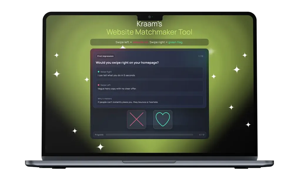
    Kraam's Website Matchmaker Tool

    Run a quick vibe check and see if your site’s turning heads.

    The most common and overlooked website “icks” – and how they cause real problems for businesses  

    Many of the biggest problems with websites aren’t dramatic or obvious – they’re small friction points that quietly frustrate users and push them away. Over time, these “icks” add up, affecting how long people stay on a site, how much they trust it, and whether they take action.  

    Some of the most common and overlooked issues include neglecting to build trust and legitimacy, preventing people from breathing while checking out a site and displaying information with disorganisation and a lack of clarity.  

    These problems can cause real problems for businesses, and here’s how:  

    Vague and shallow homepages 

    Users can click away from a site and its services if they can’t instantly place it – and a homepage containing hollow, empty language is a quick way to kill trust and attention.  

    Making a first impression is very important, and users will click off a site and find another one if they’re not instantly convinced to explore further.  

    Slow loading times 

    Pages that take too long to load test patience immediately and users are far less likely to engage with the content or delve into a company’s services if a site feels sluggish from the outset. 

    Studies show the average attention span is gradually reducing and if you’re struggling to reel someone in within a few minutes, it’s highly likely a prospective customer will bounce and take their business elsewhere.  

    Confusing or unclear navigation 

    Overloaded menus, vague labels or poorly structured pages make it difficult for users to find key information. When people can’t quickly locate what they need, they tend to leave. 

    It’s also worth noting that a website acts as a mirror for a business – so including mess and disorganisation can reflect negatively on a company and its services.  

    Poor mobile responsiveness 

    Websites that don’t adapt properly to smaller screens – with broken layouts, hard-to-read text or awkward buttons – risk alienating mobile users. 

    These days, many people opt to browse the internet on their phones rather than a laptop or tablet, so a website that fails to cater for most of its visitors will quickly become unpopular.  

    Cluttered layouts and intrusive elements 

    Too many pop-ups, banners or auto-playing videos can overwhelm visitors and distract them from the main message. 

    Stopping people from exploring a site with ease creates a stressful experience, rather than a positive one, prompting many to click away from a page which is too overloaded.  

    Unclear calls to action  

    If users don’t know what to do next, they’re unlikely to take any action at all. Websites that fail to highlight whether someone should get in touch, learn more or make a purchase risk losing prospective customers with this lack of direction.  

    Outdated or low-quality content  

    Old information, generic messaging or poorly written copy can make a business feel neglected or out of touch, even if its services are strong. 

    Neglecting to pay attention to the tone which is presented through the language displayed on a website can also quickly turn off visitors, especially if it comes across as detached and superficial. 

    Lack of trust signals 

    Missing reviews, unclear pricing, limited contact details or no evidence of real people behind the business can cause hesitation and suspicion. 

    Building trust with a new customer is pivotal, and feeding into scepticism by failing to include these markers of credibility can quickly tell people you have no legitimacy – and it’s unlikely users will return to a site where they feel the trust is broken.  

    How to rekindle the spark  

    So, what can you do about this? Luckily, we’ve got your back – and we’ve outlined a series of easy changes you can make to ensure your website delivers successfully every time.

    For your homepage, we suggest bringing it back to basics with one specific sentence. Inject clarity to ditch any uncertainty. We also advise having one, straightforward call to action, rather than multiple, to provide flow and direction to your online visitors.

    Zoom in on the language you’re putting across throughout the pages on your site and evaluate the tone it conveys. Replace any fluff with numbers and examples – and make sure you’re avoiding any disconnected, AI-style vocabulary where possible.  

    Next, turn your attention to your menu to encourage people to explore your site further. Adding clearer labels, and even a search bar if needed, is a quick and easy way to make your space more user-friendly.

    Ensure the pages of a site are simplified and easy-to-read. Remove any distractions, pop-ups, auto-playing elements and clutter to help visitors explore your site with ease and comfort.

    It’s also incredibly important to assess the legitimacy of your business by putting yourself in the shoes of your customer. Include real reviews and testimonials, as well as and clear contact details, to allow people to trust in both your site and your services. Putting together a simple ‘Meet the Team’ page also shows users the real faces behind the online space they’re exploring. A picture, a name and a job title for each of your team members is all you need – and it’s a proven way to gain trust authentically.

    Ready to kiss and make up?  

    With technological advancements taking place at rapid speed, it’s easy to feel as though your online platform is constantly going out of date. At Kraam, we know how you feel.

    To support businesses looking to make website adjustments, we’ve created an innovative Website Matchmaker Tool designed to help you decide if it’s time to part ways with your site – or if there’s a good foundation to rekindle the spark.

    Operating like a dating app, users can swipe left or right on a variety of elements that contribute to an online platform – where right is a green flag but left is an “ick”.

    Users are given a chemistry score out of 100 at the end to see how their site is fairing – and for those in trouble, we’ve highlighted a series of quick fixes so both you and your customers can fall back in love with your platform.

    Matthew Jeffers, Kraam’s website relationship guru, said:

    “If your website gives ‘it’s complicated’ vibes and your menu reads like a Chinese takeaway, with zero trust signals and stock-photo clone energy, it’s not quirky – it’s why leads are ghosting you.”

    “Our Website Matchmaker Tool will tell you whether to swipe right, swipe left or book your site in for some relationship counselling so we can bring the spark back.”

    To find out more about our services, please get in touch here.