
You’re building a website, refreshing pages or mocking up a design – and without a second thought, you reach for a familiar font. Arial. Tahoma. Times New Roman. Easy. Barely anyone gives it a second thought.
But here’s the thing: those everyday font choices are quietly working against you. At Kraam, our designers see the same fonts cropping up repeatedly, often chosen out of habit rather than intention.
It’s not that these fonts are obscure or gimmicky – it’s that they’re too familiar, regularly used without stopping to consider whether they’re actually doing the job they’re meant to do.
The Fonts Designers Love to Hate
To understand why certain styles cause so much frustration, our design team looked at a selection of widely used fonts through the same lens they use every day: how readable they are, how consistent they feel and how well they perform across modern screens and layouts.
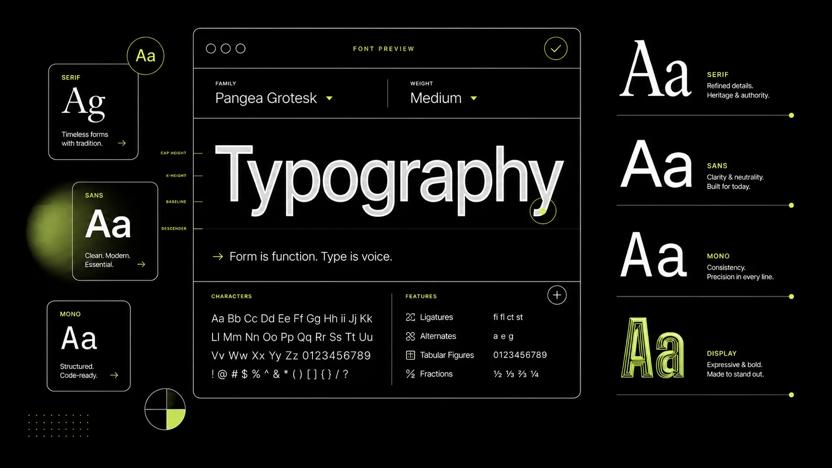
Each font was assessed across several practical design considerations:
- Proportions – how balanced and readable the overall letter shapes are
- Stroke consistency – how controlled and consistent the line weight feels
- Apertures & spacing – how open and easy the characters are to read
- Distinguishability – how clearly similar characters can be told apart
- Structural consistency – how well the font works as a cohesive system
Each was scored out of 10 for every category (50 total). Here’s how the worst offenders stacked up.
1. Arial Narrow – Score: 30/50
Arial Narrow, scoring the lowest of all, has one core issue; its compressed structure. The reduced character width pushes letters tightly together, limiting the natural spacing the eye relies on to scan text comfortably. That creates a visually cramped experience, especially across longer passages.
On a website, that compression becomes a usability problem. Users tend to scan rather than read in detail, and tightly packed text slows that process down. On smaller screens, the lack of spacing can cause characters to blur together, increasing effort and reducing clarity – both of which can impact engagement and time on page.
2. Microsoft Sans Serif – Score: 31/50
Microsoft Sans Serif lacks refinement in its proportions and spacing, giving it a slightly unbalanced, utilitarian feel. It was designed for older system environments – and that legacy still shows today.
From a web perspective, this translates into a subtle but important issue – perceived quality. Even if the text is readable, the font can make a site feel dated or less polished. That perception can influence how users judge credibility, particularly on first impressions.
3. Century Gothic – Score: 32/50
Century Gothic’s geometric design relies on near-perfect circles and uniform strokes, which reduces distinction between individual letterforms. This can make words feel visually repetitive and slightly harder to process quickly.
Its wide proportions also result in fewer words per line, increasing scroll depth and breaking reading flow, especially on mobile. What looks clean in isolation can become inefficient in real-world layouts.
4. Tahoma – Score: 33/50
Tahoma features thick, sturdy letterforms and relatively tight spacing, which can create a dense, heavy appearance. While functional, it lacks the openness that supports comfortable reading over longer stretches of text.
On websites, this kind of density quickly becomes tiring – especially on content-heavy pages. When text blocks appear visually heavy, users are less likely to engage with them, making it harder to guide attention and establish clear content hierarchy.
5. Arial – Score: 34/50
Arial’s neutral structure and minimal contrast make it highly versatile, but also visually unremarkable. It lacks the subtle characteristics that help guide the eye or create rhythm across text.
From a usability standpoint, it performs adequately – but doesn’t enhance the reading experience. On websites, this often results in content that feels generic. In competitive digital environments, that lack of distinction can impact both brand perception and user trust.
6. Trebuchet MS – Score: 35/50
Trebuchet MS introduces more personality through its varied letterforms, but this comes at the cost of consistency. Some characters feel slightly exaggerated, which can interrupt the visual rhythm of text.
Over longer passages, this can subtly disrupt reading flow. While it remains readable, it’s less predictable than more modern sans-serif fonts – which can affect how smoothly users move through content on a page.
7. Times New Roman – Score: 36/50
Times New Roman is optimised for print. Its high stroke contrast and tight spacing work well on paper – but not always on screens.
For users skimming content (which most people do), this creates friction. It can also feel out of place in modern UI design, where cleaner, simpler typography is expected.
8. Verdana – Score: 37/50
Verdana’s generous spacing and large x-height give it excellent legibility. The downside? It takes up more space than necessary.
On a website, that inefficiency can impact layout. Fewer words fit within a given space, leading to longer pages and increased scrolling. While still readable, it’s less space-efficient than newer fonts designed specifically for modern displays.
9. Georgia – Score: 38/50
Georgia offers a more refined serif structure, with solid proportions and reliable readability. However, its traditional design can feel slightly out of step with modern digital aesthetics.
On websites, this can affect how current or aligned a brand feels. While it performs well in editorial contexts, it’s not always the best choice for interfaces or conversion-focused pages where speed and clarity take priority.
10. Candara – Score: 39/50
Candara features smooth curves and open spacing, which support a comfortable reading experience. Structurally, it avoids many of the issues seen in lower-ranked fonts.
However, it lacks strong defining characteristics. On a website, that means it won’t hinder usability, but it also won’t actively support hierarchy, emphasis, or brand identity. It performs adequately but doesn’t add much to the overall effectiveness of the design.
The Do’s and Don’ts of Website Typography
Across all ten fonts, the same themes kept cropping up, from cramped spacing and weak hierarchy to inconsistent proportions. Based on those patterns, a few practical typography rules stand out.
Do:
- Choose fonts designed for digital readability.
- Prioritise open spacing and clear letterforms.
- Maintain consistency across your site.
- Test typography across devices and screen sizes.
Don’t:
- Use condensed fonts for body text.
- Default to system fonts without considering brand identity.
- Overlook spacing, hierarchy, and structure.
- Mix too many conflicting styles.
Why this matters for your website
Individually, the flaws we’ve highlighted might seem minor but together, they shape how users experience your website – often subconsciously influencing whether they stay and trust your content or leave.
Typography isn’t just about how something looks. It’s about how it works.
As Kraam’s Senior Designer, Keith Blues, puts it: “Typography is one of the most important parts of digital design because it directly affects how people consume information.
“If text is hard to read or feels visually off, users won’t spend time figuring out why – they’ll just disengage.”
If you’re unsure whether your typography is helping or hurting your site, our team is on hand to help. Reach out via our contact page here.