How to design for enterprise speed without breaking UX
Enterprise websites sit in an awkward tension. They’re expected to carry massive traffic, multiple integrations, and sprawling content structures – yet still feel as immediate and intuitive as the sharpest consumer apps. The instinct is often to chase visuals and functionality first, leaving performance to be fixed later. That’s backwards. In the enterprise world, speed isn’t a nice-to-have – it’s part of the experience.
Speed is UX
When a site hesitates, users feel it as distrust. A couple of seconds waiting for a page to load can be the difference between a decision made and a lead lost. Enterprise users, in particular, aren’t just browsing; they’re on a mission. The site’s response time is as much a part of the brand promise as its design language.
Building with constraints in mind
The smartest way to protect speed is to design within limits from the very start. Performance budgets work like architectural blueprints – they define how much weight the structure can carry before it fails. Setting thresholds for things like load times, font usage, and media weight keeps ambition grounded in reality.
- Time to First Byte (TTFB) under 0.3s
- Largest Contentful Paint (LCP) under 2.5s
- Strict limits on web font families and third-party scripts
These aren’t abstract numbers; they’re the guardrails that keep a polished design from collapsing under its own weight.
Clarity over clutter
Another principle is to focus the opening view. The first screen should hold the essentials: a headline that anchors the message, a clear call-to-action, and a single supporting image or video. Everything else can load progressively. Skeleton screens and subtle placeholders are useful here, buying the user confidence that the site is alive and responsive.
Systems beat one-offs
Speed is also a by-product of discipline. Designing a component system – where each element is optimised once and reused everywhere – prevents the creep of CSS and JavaScript bloat. It also locks in consistency, so a brand can scale without every new page becoming a performance gamble.
Collaboration, not compromise
Performance is often cast as a battle between design and development: pixels versus page weight. That’s a false dichotomy. Many of the biggest wins come from collaboration as we do at Kraam – choosing SVGs instead of heavy PNGs, or letting CSS handle motion instead of JavaScript. These choices protect both the aesthetic and the load time.
Test like it’s real
Enterprise websites usually perform beautifully on a staging server and then struggle in the wild. Testing has to reflect reality: throttled bandwidth, global CDNs, real devices. What matters isn’t just raw page speed, but how quickly a user can actually interact with the site. Accessibility checks belong here too. Speed is useless if key audiences can’t navigate.
Think beyond borders
For global enterprises, there’s also the matter of geography. What loads instantly on a London fibre connection might crawl on a mobile device in Southeast Asia. Edge caching, localisation, and mobile-first layouts aren’t just technical fixes; they’re strategies to make a brand genuinely accessible worldwide.
In conclusion
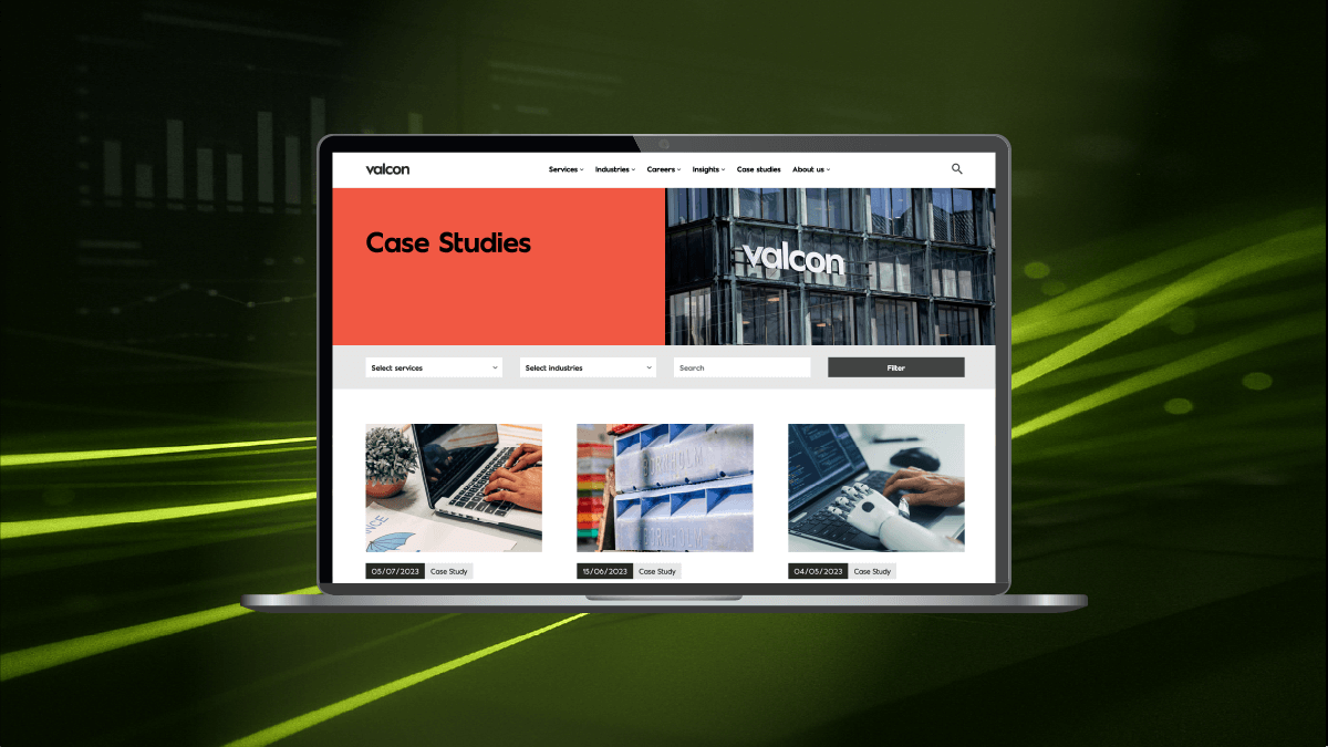
Designing for speed isn’t about restraint. It’s about alignment – where technical excellence and user experience pull in the same direction. When a site is both fast and intuitive, like Valcon, the brand feels confident, the message lands cleanly, and users don’t notice the infrastructure at all. They just get where they need to go. And that’s the whole point.


