Category: UX/UI

  • Customer Journey vs User Journey: A Practical Guide for Websites

    Customer Journey vs User Journey: A Practical Guide for Websites

    Customer Journey vs User Journey: A Practical Guide for Websites 

    Understanding how people interact with your website is essential but understanding how they interact with your brand is what really drives growth.

    That’s where the distinction between the user journey and the customer journey becomes critical.

    These terms are often used interchangeably, but they’re two very different concepts in practice. When businesses confuse them, websites may look good and function well, yet still fail to convert, retain, or build long-term value.

    This guide explains the key differences between the user journey vs customer journey, why both matter, and how aligning them leads to better websites and stronger business outcomes.


    What is a Customer Journey?

    The customer journey describes the complete end-to-end experience a person has with your brand, across all channels and touchpoints, both digital and offline.

    It starts long before someone lands on your website and continues long after a conversion takes place.

    Key characteristics of a customer journey

    • Covers the entire lifecycle of a relationship with your brand
    • Includes marketing, sales, product usage, support, and retention
    • Spans multiple platforms and interactions (ads, search, website, email, social, customer service, etc.)
    • Focuses on perception, trust, loyalty, and long-term value

    Typical customer journey stages

    While models can vary, most customer journeys include stages like:

    • Awareness – discovering your brand or problem
    • Consideration – comparing options and researching solutions
    • Decision – converting, purchasing, or enquiring
    • Retention – continued usage and engagement
    • Advocacy – recommending or promoting your brand

    Your website usually plays a role in multiple stages, not just the point of conversion.


    What Is a User Journey?

    A user journey focuses on how someone interacts with a specific digital experience, usually your website or application.

    Rather than the full brand relationship, it looks at how users’ complete tasks, move through interfaces, and achieve goals within a defined environment.

    Think of it like the action part of the customer journey where users are actually engaging with your website, features and products.

    Key characteristics of a user journey

    • Narrower and more focused than the customer journey
    • Typically limited to on-site or in-app behaviour and usability
    • Task-driven (like “request a quote”, “find pricing”, “complete checkout”)
    • Closely linked to UX, UI, and interaction design

    Examples of user journeys

    • Landing on a homepage → navigating to services → submitting a contact form
    • Visiting a blog post → clicking a CTA → downloading a resource
    • Browsing products → filtering results → completing checkout

    User journeys are concerned with usability, clarity, and friction, rather than the broader emotional or brand relationship.


    User Journey vs Customer Journey: What’s the Difference?

    Although they’re closely related, the user journey vs customer journey differ in scope, purpose, and measurement.

    AspectCustomer JourneyUser Journey
    ScopeHolistic and long-term, covering the full relationship with a brandSpecific, focused, and short-term
    FocusBrand perception, trust, and overall lifecycle valueTask completion and interface usability
    InteractionsOnline and offline interactions (ads, emails, website visits, sales calls, support)Primarily digital interactions (website or app)
    OwnershipMarketing, sales, customer success, and leadership teamsUX designers, developers, and product teams
    Primary QuestionWhy someone is interacting with your brandHow someone interacts with your website

    Put simply, the customer journey explains why someone is interacting with your brand.
    The user journey explains how they interact with your website.


    How User Journeys and Customer Journeys Work Together

    The most effective websites don’t optimise for one journey in isolation.

    A seamless user journey supports the broader customer journey — and a well-understood customer journey provides the context that makes user journeys meaningful.

    For example:

    • A frictionless contact form improves the user journey
    • Clear messaging aligned to buyer intent improves the customer journey
    • Together, they increase conversion quality and long-term satisfaction

    When businesses only focus on UX without understanding customer context, websites may be easy to use but poorly aligned with real motivations.


    What Is Journey Mapping?

    Journey mapping is the process of visualising how people experience your brand or website over time.

    Customer journey mapping

    A customer journey map outlines:

    • Touchpoints across channels
    • Emotions, motivations, and pain points
    • Gaps or inconsistencies in the brand experience

    It helps teams understand where prospects drop off, lose trust, or disengage.

    User journey mapping

    A user journey map focuses on:

    • Entry points to the website
    • User actions and decision points
    • Barriers, friction, or confusion
    • Opportunities to improve flow and clarity

    This is particularly useful during website redesigns or UX optimisation projects.


    How to Optimise the Customer Journey Through Your Website

    Your website should support multiple stages of the customer journey, not just the final conversion moment.

    Many websites are built entirely around “getting the lead” but fail to address what users need before and after that point. Optimising the customer journey means designing your site to guide people from first awareness through to long-term engagement.

    Tailor messaging to different levels of awareness

    Not every visitor is ready to convert. Some are discovering a problem for the first time, while others are actively comparing providers.

    Your website should:

    • Introduce problems and opportunities clearly for early-stage visitors
    • Provide deeper, more specific information for those in the consideration stage
    • Reinforce confidence and clarity for decision-ready users

    This often means using layered content across landing pages, blogs, case studies, and FAQs rather than forcing everyone down the same path.

    Answer questions at the consideration stage

    At the consideration stage, users are actively evaluating options. If your website doesn’t answer their questions, they’ll likely leave to find answers elsewhere.

    Effective websites:

    • Anticipate common objections and uncertainties
    • Explain processes, pricing structures, and outcomes clearly
    • Use comparisons, examples, and proof points where appropriate

    This content builds trust and reduces the cognitive load required to move forward.

    Use trust signals to reduce decision friction

    Trust is one of the biggest blockers in the customer journey, especially for high-value or service-based purchases.

    Your website can reduce friction by including:

    • Testimonials and case studies
    • Client logos or recognisable brands
    • Clear contact details and transparency
    • Professional design/branding and consistent messaging

    These signals reassure users that progressing is a safe and sensible decision.

    Use data to identify journey gaps

    Analytics, CRM data, and user feedback are essential for understanding where the website is failing to support the wider journey.

    Drop-offs, repeated questions, and stalled leads often indicate:

    • Missing information
    • Poor alignment between marketing and UX
    • Mismatched expectations

    Optimisation starts with understanding why people disengage, not just where.


    How to Optimise User Journeys on Your Website

    Optimising user journeys is about making it easy and intuitive for people to complete tasks without confusion or friction.

    While customer journey optimisation is strategic and holistic, user journey optimisation is more tactical and UX-focused.

    Create clear navigation and information architecture

    Users should never have to guess where to go next.

    Effective information architecture:

    • Groups content logically
    • Uses clear, descriptive labels
    • Reflects how users think, not internal company structure

    When navigation mirrors user intent, journeys become shorter and more confident.

    Design intuitive layouts and visual hierarchy

    Page layouts should guide attention naturally, not compete for it.

    Strong user journeys rely on:

    • Clear headings and spacing
    • Visual cues that highlight priority actions
    • Consistent patterns across the site

    This reduces cognitive effort and helps users progress without hesitation.

    Test assumptions with real behaviour

    Internal assumptions about how users “should” behave are often wrong.

    User journey optimisation depends on:

    • Observing real behaviour
    • Identifying unexpected patterns
    • Iterating based on evidence, not opinion

    Small changes informed by real data often outperform major redesigns based on guesswork.

    Use the right tools to uncover friction

    Tools like:

    • Heatmaps
    • Session recordings
    • Usability testing
    • Conversion tracking

    help uncover where users hesitate, struggle, or abandon tasks — and why.

    These insights turn UX improvements from subjective debates into measurable improvements.


    Common Mistakes Businesses Make

    Many underperforming websites don’t fail because of poor execution, but because of flawed thinking.

    Some of the most common mistakes include:

    Treating user journey and customer journey as the same thing

    When these concepts are conflated, websites become either:

    • Overly tactical, ignoring broader context
    • Or overly strategic, ignoring usability

    Both journeys need to be understood and optimised together.

    Optimising pages in isolation

    Improving individual pages without considering the wider journey often creates disconnected experiences.

    Users don’t experience websites page by page — they experience them as flows.

    Prioritising aesthetics over usability

    Visual design matters, but not at the expense of clarity.

    Websites that look impressive but feel confusing often:

    • Increase bounce rates
    • Reduce conversion confidence
    • Create unnecessary friction

    Good design supports usability, not the other way around.

    Designing for internal assumptions instead of real users

    Internal teams are rarely representative of real users.

    When websites are built around internal language, priorities, and workflows, they often fail to align with how users actually think and behave.


    Optimise Your Website with Kraam

    Don’t lose customers or put users off because of poor experiences — the best companies strengthen both.

    Kraam’s comprehensive website development services makes sure that things are optimised from the moment a potential customer becomes a user.

    Contact us today and speak to a specialist to find out how you can get started.

  • How to Create a Sustainable Website

    How to Create a Sustainable Website

    How to Create a Sustainable Website 

    Websites play a bigger role in climate impact than many people realise.

    Every page load consumes energy, contributes to carbon emissions, and places demand on servers, networks, and user devices.

    As digital products continue to grow in size and complexity, their environmental footprint grows with them.

    In this comprehensive guide, we explore what sustainable web design is, why it matters, and how you can apply practical principles to create a more sustainable website.


    What Is Sustainable Web Design?

    Sustainable web design is an approach to designing and building websites that minimises environmental impact, while maximising usability and performance.

    It prioritises efficiency across design, development, hosting, and ongoing maintenance.

    Rather than adding features by default, sustainable web design encourages intentional decisions – reducing unnecessary data transfer, simplifying layouts, and optimising how a website is delivered to users.

    The result? A website that loads faster, consumes less energy, and performs better for both users, LLMs and search engines.


    Why Sustainable Web Design Matters

    Sustainable web design isn’t just about reducing environmental impact – it also improves how websites perform, how users experience them, and how well they support long-term business goals.

    Here are some of the key reasons why sustainability built into your website design matters:

    Reducing Environmental Impact

    Every website relies on data centres, networks, and user devices that consume electricity.

    Poorly optimised websites increase energy usage through large file sizes, excessive scripts, and inefficient hosting.

    Sustainable web design helps reduce this digital carbon footprint by cutting unnecessary resource use.

    Better Performance and User Experience

    Sustainable websites are typically faster and easier to use.

    Leaner code, fewer assets, and efficient loading improve page speed, responsiveness, and accessibility – all of which directly impact user experience.

    Long-Term Business Value

    Sustainable web design supports longevity.

    Websites that are simpler and more efficient are easier to maintain, scale, and update over time.

    Performance improvements also support SEO, helping websites remain competitive as search engines continue to prioritise speed and usability.


    Core Principles of Sustainable Web Design

    At the heart of sustainable web design are a set of principles that guide decision-making throughout the design and development process.

    These principles focus on reducing waste, improving efficiency, and ensuring websites are built to perform responsibly over time.

    The main ones to consider are:

    Energy Efficiency

    Energy-efficient websites reduce the amount of data transferred between servers and users. This includes limiting file sizes, reducing page weight, and avoiding unnecessary processing.

    Minimalism and Performance Focus

    Designing with restraint is key. Clear layouts, purposeful content, and reduced reliance on heavy scripts help keep websites lightweight and efficient without sacrificing quality.

    Accessibility and Inclusive Design

    Accessible websites are more sustainable. Clear navigation, readable typography, and logical structure reduce friction and improve usability for all users, while also supporting performance and efficiency.

    Responsible Infrastructure

    Sustainable web design extends beyond the interface. Choosing responsible hosting providers and infrastructure powered by renewable energy plays a crucial role in reducing overall environmental impact.


    Step-by-Step Guide to Creating a Sustainable Website

    Building a sustainable website requires a structured, intentional approach.

    From early planning through to long-term optimisation, each stage of the process presents opportunities to reduce impact and improve efficiency.

    #Step 1: Define Purpose and Content Strategy

    Start by clarifying the purpose of your website. Every page and feature should have a clear role. Reducing unnecessary content and functionality helps limit complexity and keeps the site focused.

    #Step 2: Design with Efficiency in Mind

    Design decisions have a direct impact on sustainability. Prioritise clear layouts, system fonts, and restrained use of imagery. Avoid design elements that add weight without delivering value.

    #Step 3: Choose Sustainable Hosting

    Select hosting providers that prioritise renewable energy and efficient infrastructure. Content delivery networks (CDNs) can also reduce energy usage by serving content closer to users.

    #Step 4: Optimise Code and Assets

    Clean, efficient code is essential. Compress images, minimise scripts, reduce third-party integrations, and defer non-essential resources to lower page weight and improve performance.

    #Step 5: Monitor and Improve Over Time

    Sustainability is ongoing. Regularly monitor performance, page weight, and energy usage to identify areas for improvement as your website evolves.


    Tools and Resources for Sustainable Web Design

    A range of tools can help measure and improve website sustainability. Carbon measurement tools, performance audits, and accessibility checkers provide insights into how efficiently a website operates and where improvements can be made.

    Using these tools regularly ensures sustainability remains part of long-term website management rather than a one-off consideration.


    Common Mistakes to Avoid

    Even with the right intentions, it’s easy for sustainability to be undermined by common design and development habits. Being aware of these pitfalls helps ensure sustainable web design principles are applied consistently, not accidentally undone as a website evolves.

    • Overloading pages with unnecessary scripts or trackers
    • Ignoring accessibility during design and development
    • Using unoptimised images and media assets
    • Treating sustainability as a one-time task rather than an ongoing process

    Build a Sustainable Website with Kraam

    Creating a sustainable website requires more than good intentions; it demands a thoughtful strategy, performance-led design, and responsible development decisions.

    At Kraam, sustainability is embedded into every stage of the web design process.

    We help organisations design and build websites that are efficient, accessible, and built to last.

    From performance-first UX and lightweight builds to responsible hosting and maintenance guidance and long-term optimisation, our sustainable web design approach reduces digital impact while improving usability and site performance.

    Interested? Contact us today and get started with your project.


    Building a sustainable website FAQs:

    See some of the most frequently asked questions about sustainable websites here:

    Why is sustainable web design important?

    Websites consume energy every time they are loaded. Sustainable web design helps reduce this energy usage, lowering a site’s digital carbon footprint while also improving speed, user experience, and long-term maintainability.

    How do you create a sustainable website?

    Creating a sustainable website starts with clear purpose and efficient design. It involves reducing unnecessary content, optimising code and assets, choosing responsible hosting, and continuously monitoring performance to minimise resource use over time.

    Does sustainable web design affect SEO?

    Yes, sustainable web design often leads to faster load times, better accessibility, and improved user experience.

    All of these are factors that search engines consider when ranking websites.

    What makes a website environmentally friendly?

    An environmentally friendly website uses less data, loads efficiently, runs on responsible infrastructure, and avoids unnecessary scripts or media. These choices reduce energy consumption across servers, networks, and user devices.

    Is sustainable web design more expensive?

    Not necessarily.

    While it requires thoughtful planning and perhaps a higher upfront cost at times, sustainable web design often reduces long-term costs by improving performance, simplifying maintenance, and extending the lifespan of a website.

  • Is it time to break up with your website?

    Is it time to break up with your website?

    Is it time to break up with your website?

    People are easily turned off from websites these days as a host of issues like slow loading times, intrusive pop-ups, confusing navigation and broken links leave many quickly clicking away.   

    For businesses using their website to showcase their services, these problems – or browser “icks” – can be the difference between a prospective customer exploring an online platform with ease or swiftly closing an overloaded tab without realising its full potential.    

    Many businesses, especially those who have been in the game for a long time, often go months or years without giving their website a much-needed overhaul. 

    The result? An out-of-date website where a company’s hard work is buried and lost under a cluttered page layout, auto-playing videos or excessive ads.   

    If you’ve fallen out of love with your website, or you fear your customers are getting the “ick” from your platform, don’t fret. We seek to outline the biggest problems businesses are making with their site and the easiest ways to fix them.  

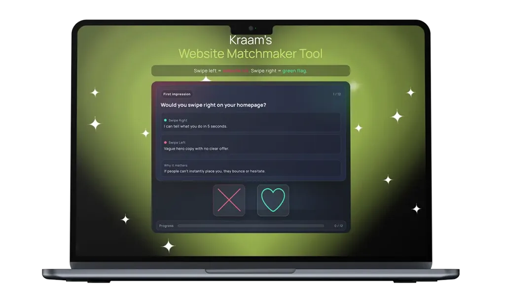
    Kraam's Website Matchmaker Tool

    Run a quick vibe check and see if your site’s turning heads.

    The most common and overlooked website “icks” – and how they cause real problems for businesses  

    Many of the biggest problems with websites aren’t dramatic or obvious – they’re small friction points that quietly frustrate users and push them away. Over time, these “icks” add up, affecting how long people stay on a site, how much they trust it, and whether they take action.  

    Some of the most common and overlooked issues include neglecting to build trust and legitimacy, preventing people from breathing while checking out a site and displaying information with disorganisation and a lack of clarity.  

    These problems can cause real problems for businesses, and here’s how:  

    Vague and shallow homepages 

    Users can click away from a site and its services if they can’t instantly place it – and a homepage containing hollow, empty language is a quick way to kill trust and attention.  

    Making a first impression is very important, and users will click off a site and find another one if they’re not instantly convinced to explore further.  

    Slow loading times 

    Pages that take too long to load test patience immediately and users are far less likely to engage with the content or delve into a company’s services if a site feels sluggish from the outset. 

    Studies show the average attention span is gradually reducing and if you’re struggling to reel someone in within a few minutes, it’s highly likely a prospective customer will bounce and take their business elsewhere.  

    Confusing or unclear navigation 

    Overloaded menus, vague labels or poorly structured pages make it difficult for users to find key information. When people can’t quickly locate what they need, they tend to leave. 

    It’s also worth noting that a website acts as a mirror for a business – so including mess and disorganisation can reflect negatively on a company and its services.  

    Poor mobile responsiveness 

    Websites that don’t adapt properly to smaller screens – with broken layouts, hard-to-read text or awkward buttons – risk alienating mobile users. 

    These days, many people opt to browse the internet on their phones rather than a laptop or tablet, so a website that fails to cater for most of its visitors will quickly become unpopular.  

    Cluttered layouts and intrusive elements 

    Too many pop-ups, banners or auto-playing videos can overwhelm visitors and distract them from the main message. 

    Stopping people from exploring a site with ease creates a stressful experience, rather than a positive one, prompting many to click away from a page which is too overloaded.  

    Unclear calls to action  

    If users don’t know what to do next, they’re unlikely to take any action at all. Websites that fail to highlight whether someone should get in touch, learn more or make a purchase risk losing prospective customers with this lack of direction.  

    Outdated or low-quality content  

    Old information, generic messaging or poorly written copy can make a business feel neglected or out of touch, even if its services are strong. 

    Neglecting to pay attention to the tone which is presented through the language displayed on a website can also quickly turn off visitors, especially if it comes across as detached and superficial. 

    Lack of trust signals 

    Missing reviews, unclear pricing, limited contact details or no evidence of real people behind the business can cause hesitation and suspicion. 

    Building trust with a new customer is pivotal, and feeding into scepticism by failing to include these markers of credibility can quickly tell people you have no legitimacy – and it’s unlikely users will return to a site where they feel the trust is broken.  

    How to rekindle the spark  

    So, what can you do about this? Luckily, we’ve got your back – and we’ve outlined a series of easy changes you can make to ensure your website delivers successfully every time.

    For your homepage, we suggest bringing it back to basics with one specific sentence. Inject clarity to ditch any uncertainty. We also advise having one, straightforward call to action, rather than multiple, to provide flow and direction to your online visitors.

    Zoom in on the language you’re putting across throughout the pages on your site and evaluate the tone it conveys. Replace any fluff with numbers and examples – and make sure you’re avoiding any disconnected, AI-style vocabulary where possible.  

    Next, turn your attention to your menu to encourage people to explore your site further. Adding clearer labels, and even a search bar if needed, is a quick and easy way to make your space more user-friendly.

    Ensure the pages of a site are simplified and easy-to-read. Remove any distractions, pop-ups, auto-playing elements and clutter to help visitors explore your site with ease and comfort.

    It’s also incredibly important to assess the legitimacy of your business by putting yourself in the shoes of your customer. Include real reviews and testimonials, as well as and clear contact details, to allow people to trust in both your site and your services. Putting together a simple ‘Meet the Team’ page also shows users the real faces behind the online space they’re exploring. A picture, a name and a job title for each of your team members is all you need – and it’s a proven way to gain trust authentically.

    Ready to kiss and make up?  

    With technological advancements taking place at rapid speed, it’s easy to feel as though your online platform is constantly going out of date. At Kraam, we know how you feel.

    To support businesses looking to make website adjustments, we’ve created an innovative Website Matchmaker Tool designed to help you decide if it’s time to part ways with your site – or if there’s a good foundation to rekindle the spark.

    Operating like a dating app, users can swipe left or right on a variety of elements that contribute to an online platform – where right is a green flag but left is an “ick”.

    Users are given a chemistry score out of 100 at the end to see how their site is fairing – and for those in trouble, we’ve highlighted a series of quick fixes so both you and your customers can fall back in love with your platform.

    Matthew Jeffers, Kraam’s website relationship guru, said:

    “If your website gives ‘it’s complicated’ vibes and your menu reads like a Chinese takeaway, with zero trust signals and stock-photo clone energy, it’s not quirky – it’s why leads are ghosting you.”

    “Our Website Matchmaker Tool will tell you whether to swipe right, swipe left or book your site in for some relationship counselling so we can bring the spark back.”

    To find out more about our services, please get in touch here.


  • Grid systems still matter in 2025

    Grid systems still matter in 2025

    Grid systems still matter in 2025

    Design trends are loud. They flare up on social feeds, fill dribble shots, and disappear almost as quickly as they arrived. Glassmorphism, brutalism, neumorphism – all had their moment. Yet through every shift, something quieter has held steady: the grid.

    Grids rarely make headlines because they’re not meant to. They’re invisible scaffolding. But in enterprise web design, where complexity and scale can overwhelm, grids aren’t optional. They’re the skeleton that keeps everything coherent. In 2025, when content sprawls across global markets, multi-team workflows, and endless device sizes, the humble grid matters more than ever.


    The hidden discipline

    A grid is a set of invisible vertical and horizontal lines that structure content. To users, it’s barely perceptible. To designers and developers, it’s order. Headings align with body copy. Images don’t clash with CTAs. White space breathes evenly.

    That discipline creates clarity. For enterprises, clarity isn’t just aesthetic – it’s commercial. A grid means new content added by one team in London doesn’t visually clash with updates from a team in Singapore. It means marketing can launch campaign pages without breaking the brand’s rhythm.

    The irony is that grids succeed precisely when they go unnoticed. Users don’t think, “nice grid.” They think, “this site feels easy to read, easy to navigate, trustworthy.” – the next site you come across, take a moment and feel look at the natural spacing and rhythm flow.


    Enterprise chaos without grids

    The larger the organisation, the more voices touch the site. Marketing, HR, product, compliance, global subsidiaries – all producing content at speed. Without grids, that content collides. Boxes overlap. Headings vary wildly. Layouts shift jarringly between pages.

    Users experience this as confusion. And confusion at scale is expensive. Bounce rates rise. Conversion funnels leak. The brand feels inconsistent.

    A grid doesn’t solve the politics of multiple teams, but it gives them a common language. Everyone works within the same framework. Even when the content differs, the site still feels like one brand.


    Grids and responsiveness

    In 2025, “responsive” isn’t a buzzword – it’s a baseline expectation. But true responsiveness doesn’t just mean shrinking content to fit a mobile screen. It means designing layouts that flex gracefully across every device.

    Grids make this possible. A 12-column system, for instance, allows designers to define how elements collapse, stack, or expand at different breakpoints. On desktop, a three-column layout might present rich visuals. On mobile, the same structure collapses into a single clean column.

    Without grids, responsiveness becomes a tangle of exceptions. With grids, it becomes predictable and scalable.


    The psychology of order

    There’s also a deeper layer at play: psychology. Humans naturally seek patterns. When we read, our eyes scan for alignment, rhythm, balance. A broken layout forces the brain to work harder. A well-structured grid reduces cognitive load.

    For enterprises, that matters because their audiences are often time-pressed professionals, decision-makers, or consumers comparing options. If the site feels chaotic, trust erodes. If it feels structured, trust builds – even if the user can’t articulate why.


    Grids in the age of design systems

    Today, most enterprises rely on design systems: libraries of components that can be reused across pages and products. Grids are what anchor those systems. A button, a card, a hero image – each takes its place in a predictable structure.

    This consistency reduces bloat, accelerates builds, and keeps developers sane. When the grid is clear, adding new components is simple. When it isn’t, every new feature feels like wrestling with unpredictability.

    Grids, in short, are the quiet enabler of scale.


    Not rigidity, but rhythm

    Critics sometimes argue that grids stifle creativity. That they force sites into cookie-cutter layouts. But the opposite is true. A grid is rhythm, not rigidity. Within it, designers can play, stretch, and break expectations deliberately – because there’s a baseline to return to and it becomes an automatic default for the designer to energise a design, knowing the foundational grid is unpinning the structure.

    Think of jazz: the structure of scales and timing is what allows improvisation. Grids play the same role in design. They create freedom through discipline.


    Why grids matter more in 2025

    With AI-assisted design tools rising, it might be tempting to think grids are obsolete. After all, algorithms can auto-arrange elements for multiple screen sizes. But even AI needs rules. The most effective automated systems are trained on the principles of grids: balance, alignment, proportion.

    For enterprises, where longevity and consistency matter, grids remain the anchor. AI can help generate options, but grids ensure those options feel cohesive across a sprawling ecosystem of pages and campaigns.


    In summary

    Trends come and go. Grids remain. They are the quiet architecture of trust on the web – the difference between a site that feels like a scattered collection of pages and one that feels like a coherent whole.

    For enterprises, where scale magnifies chaos, grids are not optional. They’re the unsung heroes of clarity, coherence, and credibility. Users may never notice them and that’s exactly the point.