





Author: MRS Digital

  • Britain’s Most Googled Internet FAQs Revealed 

    Britain’s Most Googled Internet FAQs Revealed 

    Britain’s Most Googled Internet FAQs Revealed

    In the last decade alone, we’ve seen rapid advancements in artificial intelligence, cloud computing, and digital platforms that now power everything from shopping and banking to entertainment and communication. 

    And yet, while technology continues to move at an incredible pace, many people are still trying to understand the fundamentals of how the internet actually works. 

    To explore the UK’s digital curiosity, we analysed search data to uncover the internet-related questions Brits are Googling every month. From technical terms like “IP address” and “bandwidth” to more basic questions about websites and browsers, the data reveals the topics that people across the UK are still keen to understand. 

    Importantly, this isn’t about highlighting a lack of knowledge or poking fun at those asking questions. Instead, the findings highlight the growing curiosity people have about the digital tools they use every day – and the opportunities for businesses and individuals alike to build greater digital confidence. 

    Some of the Most Surprising Searches 

    Beyond the most popular and least common queries, several search terms stand out simply because they reveal how frequently people are trying to understand internet basics. 

    For instance, “who owns the internet” receives around 720 searches in the UK per month, while “what is a tab” sees around 590 monthly searches. Questions about browser cookies also appear regularly, with “what are browser cookies” receiving around 480 searches each month. 

    Even some of the core building blocks of the web generate steady search interest. Questions like “how does the internet work” and “what is a website” both receive approximately 1,300 monthly searches in the UK – a staggering amount. 

    Some of the more unusual searches in the data brought some humour to the data. For example, around 140 people worldwide search for “where is the any key” monthly, referencing the running joke of the “mythical keyboard button” that doesn’t actually exist.  

    Others appear to imagine the internet as a physical place, with searches like “where is the internet located” also appearing in the data. While these questions might raise a smile, they highlight how the internet can still feel abstract to many people, despite being something we use every day. 

    For some, these questions may seem obvious; particularly for those who grew up using the internet daily. However, the results highlight just how much specialised terminology around digital technology there is. Terms like “URL”, “browser”, and “domain” are used constantly online, yet their meanings aren’t always immediately clear. 

    The Nation’s Most Googled Internet FAQs 

    Term UK Avg. Monthly GSV RANK by GSV 
    what is seo 8100 
    how do i clear browser cookies 6600 
    what is an ip address 6600 
    what does a url stand for 3600 
    what is a server 3600 
    what is broadband 3600 
    what is a database 2900 
    what is a firewall 2900 
    what is bandwidth 2900 
    what is html 2900 

    *Note: GSV = Google Search Volume 

    At the top of the list sits the question “what is SEO?”, which receives an impressive 8,100 searches every month in the UK. This suggests that many people, particularly businesses and entrepreneurs, are keen to understand how websites appear in search engine results and how online visibility works. 

    Other highly searched terms highlight curiosity around the technical infrastructure behind the internet. Questions about IP addresses, servers, bandwidth and databases all rank highly, showing that people want to better understand how data moves across the web. 

    Website-related terminology also features prominently. Searches for phrases like “what is a domain name,” “what is WordPress,” and “what is a CMS” suggest many users are researching how websites are built and managed. As more individuals and businesses establish an online presence, interest in these foundational topics is only likely to grow. 

    Looking at the Lesser-Searched Questions 

    Term UK Avg. Monthly GSV RANK by GSV 
    what is a web application 390 30 
    what does www mean 260 31 
    what is the difference between http and https 260 31 
    how do i make a website 170 33 
    what is a back end 110 34 
    what is front end 70 35 
    where is the internet located 40 36 
    how do i get more internet 10 37 
    what is a vpn 10 37 
    where is the any key 10 37 
    does clearing history delete it forever 10 37 

    *Note: GSV = Google Search Volume 

    While many internet questions receive thousands of searches each month, some queries appear less frequently but still offer an interesting glimpse into how people think about technology. 

    For example, questions like “where is the internet located” receive around 40 searches in the UK per month, while phrases like “how do I get more internet,” “what is a VPN,” and “where is the any key” receive around 10 searches each month. 

    Although these numbers are small compared to the most searched terms, they highlight how people often conceptualise the internet in physical terms. It’s easy to imagine the internet as something that exists in a single location or as a physical entity, when in reality, it is a vast global network of connected computers, servers and data centres. 

    Other questions reflect everyday digital experiences that can cause confusion. For example, some users search whether clearing their browser history deletes information permanently, suggesting many people are still learning how browsers, internet providers and online data storage work. 

    Insight and Advice 

    While the data highlights the questions people are searching for most often, many of these topics are simply technical terms that form the foundation of how the internet works. 

    To help demystify some of the most common queries, here are simple explanations for several of the most searched internet-related questions in the UK. 

    What is SEO? 

    SEO (Search Engine Optimisation) refers to the process of improving a website so that it appears higher in search engine results such as Google. 

    SEO can involve improving website content, making pages load faster, organising site structure and ensuring search engines can easily understand what a page is about. For businesses, good SEO helps potential customers find their website more easily online. 

    What is an IP address? 

    An IP address (Internet Protocol address) is a unique numerical identifier assigned to a device on a network. 

    It works a bit like a postal address for your computer or smartphone, allowing information to be sent to and from the correct location when you browse websites or send data online. 

    What does a URL stand for? 

    A URL stands for Uniform Resource Locator. It is the web address you type into a browser to access a specific webpage. 

    For example, when you visit a website like https://example.com, that address is the URL that tells your browser exactly where to find the page you want to view. 

    What is a server? 

    A server is a computer or system that manages, stores and provides data or services to other devices on a network. 

    When a user visits a website or requests information, their device sends a request to the server, which processes it and returns the correct data, such as a webpage, file or application. 

    What is broadband? 

    Broadband refers to a high-speed internet connection that allows users to access the internet quickly and continuously. 

    Most homes and businesses rely on broadband connections delivered through fibre, cable or wireless networks to stream videos, browse websites and use online services. 

    What is HTML? 

    HTML stands for HyperText Markup Language, which is the standard code used to create and structure webpages. 

    It determines how elements like text, images and links appear on a webpage. While modern websites often use additional technologies, HTML remains the core building block of web pages. 

    What the Findings Suggest 

    As more of our daily lives move online, it’s perhaps no surprise that people are increasingly searching for answers about how the internet works. From launching websites and online businesses to navigating digital privacy and security, understanding the foundations of the web has become more relevant than ever. 

    The data suggests that rather than taking technology for granted, many people are actively trying to better understand the systems that power the digital world around them.  

    Looking to Build or Improve Your Website? 

    With searches like “how do I build a website?” appearing regularly in the data, it’s clear many people are thinking about creating their own online presence. But building a website that’s fast, secure and built to grow takes more than just a template. 

    The good news? You don’t have to figure it all out yourself. Kraam offers expert website design and development services, along with secure hosting and ongoing website maintenance to keep your site running smoothly. 

    If you’re ready to launch or improve your website, get in touch with the Kraam team to discuss your project. 

  • Mobile Fonts: Why Size Matters

    Mobile Fonts: Why Size Matters

    Mobile Fonts: Why Size Matters 

    Mobile users now make up the majority of website traffic, yet many websites still rely on typography choices that were originally designed for desktop screens. Text that’s too small forces users to zoom and strain, while oversized content disrupts layout flow and increases unnecessary scrolling.

    Poorly optimised mobile font size can quickly damage readability, accessibility, and overall user experience. In turn, this friction often leads to higher bounce rates and fewer conversions, directly impacting commercial performance.

    In this comprehensive guide, we’ll explore the best font size for mobile website design, along with practical mobile font performance tips to help you improve readability, enhance UX, and support stronger SEO performance across devices of all shapes and sizes.


    Why mobile font size matters for performance, UX, and SEO

    With mobile traffic now dominating most websites, readability on smaller screens is a key performance and SEO factor.

    However, font size and typography are often the most overlooked components of a customer’s phone experience.

    If text is too small, users struggle to read your content. If it’s too large, you risk poor layout balance, excessive scrolling, and slower load times.

    Choosing the ideal font size for mobile directly affects engagement metrics like bounce rate, dwell time, and conversion rates. All of which influence how your site performs in search results.


    Why mobile font size is critical for website performance

    Google now prioritises the mobile version of your website when determining rankings (focusing on mobile-first indexing). This means your typography must support usability on smaller screens, not just look good on desktop and tablet.

    Poorly optimised mobile font size can lead to:

    • Increased bounce rates
    • Reduced session duration
    • Accessibility issues
    • User frustration & scroll fatigue
    • Lower engagement signals
    • Lower conversion rates

    All of these factors feed into the behavioural data Google uses to evaluate page experience, which is an integral ranking factor.

    Implementing practical mobile font performance tips helps guarantee your content is readable without zooming, scrolling feels natural, and navigation remains intuitive.

    This improves mobile usability scores and reduces friction across your site which is often rewarded by users and search engines.


    What is the best font size for mobile website readability?

    Choosing the best font size for mobile website content requires balancing readability with responsive layout design.

    Mobile users typically view content from a greater distance than desktop users and interact using touch, which means text needs to be easily legible without manual zooming.

    Recommended base mobile font sizes

    Below are commonly accepted guidelines for effective font size on mobile devices:

    ElementIdeal Mobile Font Size
    Body text <p>16px–18px
    Headings <h1>, <h2>, <h3>, <h4>20px–32px
    Captions12px–14px
    Buttons16px minimum
    Navigation14px–16px

    A 16px base size is widely considered the minimum for body text paragraphs because it aligns with default browser rendering on most mobile devices.

    Anything smaller may mean users have to pinch-zoom, disrupting the reading experience and increasing abandonment rates.

    By setting an appropriate mobile font size, you make it easier for users to scan content, interact with interface elements, and consume information comfortably on the move.


    How mobile font size impacts UX and SEO

    Typography affects more than visual presentation — it directly influences how users interact with your website.

    An optimised font size for mobile can:

    • Increase dwell time
    • Reduce ‘pogo-sticking‘ (when a user lands on a page and instantly leaves because of difficult navigation and bad design – a negative ranking signal)
    • Improve content comprehension
    • Support accessibility compliance
    • Encourage deeper page interaction
    • Improve conversion rates

    These outcomes contribute to stronger user engagement signals, which Google uses as part of its page experience evaluation.

    Additionally, properly sized text ensures your site meets mobile usability standards, reducing the likelihood of errors flagged in tools like Google Search Console.

    That’s why improving readability through effective mobile font size choices ultimately enhances both UX and SEO performance.


    Mobile font performance tips for faster load times

    Typography also plays a role in website performance.

    Fonts are external assets that require loading, rendering, and layout adjustments, which can impact Core Web Vitals such as Largest Contentful Paint (LCP) and Cumulative Layout Shift (CLS).

    Here are some essential mobile font performance tips to improve website speed:

    Use system fonts where possible

    System fonts load instantly because they’re already installed on users’ devices. This eliminates additional HTTP requests and reduces render-blocking delays.

    Limit font weights

    Each font weight adds another file to load. Restricting your design to two or three weights improves load time and minimises layout recalculations.

    Avoid text-blocking web fonts

    Large font files can delay text rendering, causing invisible text (FOIT) or flashes of unstyled text (FOUT).

    Use responsive typography (rem/em)

    Avoid fixed pixel values where possible. Relative units like rem or em allow your mobile font size to scale dynamically based on device settings and viewport dimensions.

    Implement font display swap

    Using the font-display: swap property ensures text appears immediately while custom fonts load in the background.

    Together, these adjustments support faster rendering and reduce the performance overhead associated with custom typography.


    Responsive design and scaling mobile font size

    Modern responsive design uses flexible text that automatically adjusts to different screen sizes. Instead of setting a fixed font size for every device, fluid sizing allows your mobile text to scale up or down depending on the screen it’s viewed on.

    Responsive typography can include:

    • Using flexible sizing instead of fixed pixel values
    • Letting text adjust based on the width of the screen
    • Applying rules that change layouts at certain screen sizes
    • Gradually scaling font sizes between devices

    These methods help keep your content easy to read on mobiles, tablets, and desktops, while still giving designers control over how the site looks.

    By allowing your mobile font size to respond to screen size and user settings, you create a more accessible and adaptable experience that works well across a wide range of devices.


    Common mobile typography mistakes to avoid

    Even well-designed websites can suffer from typography issues that negatively affect usability and performance.

    Watch out for:

    • Using desktop-optimised font sizes on mobile
    • Including too many font families
    • Ignoring line height & spacing
    • Setting fixed pixel sizes for all breakpoints
    • Choosing overly thin or lightweight fonts

    These mistakes can reduce readability, slow down rendering, and create accessibility challenges. Ensuring your best font size for mobile website setup accounts for spacing, contrast, and responsiveness helps maintain both visual clarity and technical performance.


    Expertly optimise your mobile typography with Kraam

    Improving your mobile font size isn’t just a design tweak; it’s an important performance decision that directly impacts readability, accessibility, and user experience.

    At Kraam, we take a performance-first approach to mobile web design, helping organisations implement responsive typography that enhances usability without slowing down your site.

    From scalable font systems and lightweight design and development to accessibility-focused UX and ongoing optimisation, we ensure your mobile experience supports both engagement and speed.

    If you’re looking to improve your mobile website performance and drive commercial growth, contact our team today.

  • How to Create a Sustainable Website

    How to Create a Sustainable Website

    How to Create a Sustainable Website 

    Websites play a bigger role in climate impact than many people realise.

    Every page load consumes energy, contributes to carbon emissions, and places demand on servers, networks, and user devices.

    As digital products continue to grow in size and complexity, their environmental footprint grows with them.

    In this comprehensive guide, we explore what sustainable web design is, why it matters, and how you can apply practical principles to create a more sustainable website.


    What Is Sustainable Web Design?

    Sustainable web design is an approach to designing and building websites that minimises environmental impact, while maximising usability and performance.

    It prioritises efficiency across design, development, hosting, and ongoing maintenance.

    Rather than adding features by default, sustainable web design encourages intentional decisions – reducing unnecessary data transfer, simplifying layouts, and optimising how a website is delivered to users.

    The result? A website that loads faster, consumes less energy, and performs better for both users, LLMs and search engines.


    Why Sustainable Web Design Matters

    Sustainable web design isn’t just about reducing environmental impact – it also improves how websites perform, how users experience them, and how well they support long-term business goals.

    Here are some of the key reasons why sustainability built into your website design matters:

    Reducing Environmental Impact

    Every website relies on data centres, networks, and user devices that consume electricity.

    Poorly optimised websites increase energy usage through large file sizes, excessive scripts, and inefficient hosting.

    Sustainable web design helps reduce this digital carbon footprint by cutting unnecessary resource use.

    Better Performance and User Experience

    Sustainable websites are typically faster and easier to use.

    Leaner code, fewer assets, and efficient loading improve page speed, responsiveness, and accessibility – all of which directly impact user experience.

    Long-Term Business Value

    Sustainable web design supports longevity.

    Websites that are simpler and more efficient are easier to maintain, scale, and update over time.

    Performance improvements also support SEO, helping websites remain competitive as search engines continue to prioritise speed and usability.


    Core Principles of Sustainable Web Design

    At the heart of sustainable web design are a set of principles that guide decision-making throughout the design and development process.

    These principles focus on reducing waste, improving efficiency, and ensuring websites are built to perform responsibly over time.

    The main ones to consider are:

    Energy Efficiency

    Energy-efficient websites reduce the amount of data transferred between servers and users. This includes limiting file sizes, reducing page weight, and avoiding unnecessary processing.

    Minimalism and Performance Focus

    Designing with restraint is key. Clear layouts, purposeful content, and reduced reliance on heavy scripts help keep websites lightweight and efficient without sacrificing quality.

    Accessibility and Inclusive Design

    Accessible websites are more sustainable. Clear navigation, readable typography, and logical structure reduce friction and improve usability for all users, while also supporting performance and efficiency.

    Responsible Infrastructure

    Sustainable web design extends beyond the interface. Choosing responsible hosting providers and infrastructure powered by renewable energy plays a crucial role in reducing overall environmental impact.


    Step-by-Step Guide to Creating a Sustainable Website

    Building a sustainable website requires a structured, intentional approach.

    From early planning through to long-term optimisation, each stage of the process presents opportunities to reduce impact and improve efficiency.

    #Step 1: Define Purpose and Content Strategy

    Start by clarifying the purpose of your website. Every page and feature should have a clear role. Reducing unnecessary content and functionality helps limit complexity and keeps the site focused.

    #Step 2: Design with Efficiency in Mind

    Design decisions have a direct impact on sustainability. Prioritise clear layouts, system fonts, and restrained use of imagery. Avoid design elements that add weight without delivering value.

    #Step 3: Choose Sustainable Hosting

    Select hosting providers that prioritise renewable energy and efficient infrastructure. Content delivery networks (CDNs) can also reduce energy usage by serving content closer to users.

    #Step 4: Optimise Code and Assets

    Clean, efficient code is essential. Compress images, minimise scripts, reduce third-party integrations, and defer non-essential resources to lower page weight and improve performance.

    #Step 5: Monitor and Improve Over Time

    Sustainability is ongoing. Regularly monitor performance, page weight, and energy usage to identify areas for improvement as your website evolves.


    Tools and Resources for Sustainable Web Design

    A range of tools can help measure and improve website sustainability. Carbon measurement tools, performance audits, and accessibility checkers provide insights into how efficiently a website operates and where improvements can be made.

    Using these tools regularly ensures sustainability remains part of long-term website management rather than a one-off consideration.


    Common Mistakes to Avoid

    Even with the right intentions, it’s easy for sustainability to be undermined by common design and development habits. Being aware of these pitfalls helps ensure sustainable web design principles are applied consistently, not accidentally undone as a website evolves.

    • Overloading pages with unnecessary scripts or trackers
    • Ignoring accessibility during design and development
    • Using unoptimised images and media assets
    • Treating sustainability as a one-time task rather than an ongoing process

    Build a Sustainable Website with Kraam

    Creating a sustainable website requires more than good intentions; it demands a thoughtful strategy, performance-led design, and responsible development decisions.

    At Kraam, sustainability is embedded into every stage of the web design process.

    We help organisations design and build websites that are efficient, accessible, and built to last.

    From performance-first UX and lightweight builds to responsible hosting and maintenance guidance and long-term optimisation, our sustainable web design approach reduces digital impact while improving usability and site performance.

    Interested? Contact us today and get started with your project.


    Building a sustainable website FAQs:

    See some of the most frequently asked questions about sustainable websites here:

    Why is sustainable web design important?

    Websites consume energy every time they are loaded. Sustainable web design helps reduce this energy usage, lowering a site’s digital carbon footprint while also improving speed, user experience, and long-term maintainability.

    How do you create a sustainable website?

    Creating a sustainable website starts with clear purpose and efficient design. It involves reducing unnecessary content, optimising code and assets, choosing responsible hosting, and continuously monitoring performance to minimise resource use over time.

    Does sustainable web design affect SEO?

    Yes, sustainable web design often leads to faster load times, better accessibility, and improved user experience.

    All of these are factors that search engines consider when ranking websites.

    What makes a website environmentally friendly?

    An environmentally friendly website uses less data, loads efficiently, runs on responsible infrastructure, and avoids unnecessary scripts or media. These choices reduce energy consumption across servers, networks, and user devices.

    Is sustainable web design more expensive?

    Not necessarily.

    While it requires thoughtful planning and perhaps a higher upfront cost at times, sustainable web design often reduces long-term costs by improving performance, simplifying maintenance, and extending the lifespan of a website.

  • Why brands outgrow off-the-shelf themes

    Why brands outgrow off-the-shelf themes

    Why brands outgrow off-the-shelf themes

    Off-the-shelf themes are like training wheels. They give you balance quickly, they let you move forward without much thought, and they make the early ride feel smooth. For start-ups and small businesses, that’s perfect: low cost, fast to launch, polished enough to look credible. But at enterprise scale, those same wheels stop being helpful. They become the thing slowing you down.

    This isn’t an argument against themes. They serve a purpose, and millions of sites wouldn’t exist without them. It’s about recognising the point where a tool that got you moving is now holding you back. That point often arrives sooner than brands expect.


    The performance ceiling

    Most commercial themes are built for the widest possible market. They ship with every layout, every style option, and every integration a buyer might want. That breadth is a selling point for the theme creator. But for the site owner, it translates to bloat.

    Extra JavaScript libraries, unused CSS, and poorly optimised images all pile up. You end up paying in milliseconds, and in the world of enterprise marketing, milliseconds are currency. When you’re driving tens of thousands of users through funnels each week, page speed is no longer just a technical metric—it’s conversion, trust, and revenue.

    A theme designed for “anyone” becomes a bottleneck for “everyone.”


    The plugin house of cards

    Themes rarely work alone. They lean heavily on plugins to add features—sliders, forms, SEO, e-commerce. At first this feels like flexibility. Later, it feels like dependency.

    • Plugins compete with each other for resources.
    • Updates break compatibility.
    • Security vulnerabilities multiply.

    In an enterprise environment, where marketing, IT, and legal all care about stability, this plugin sprawl creates risk. One broken dependency can knock out an entire sales funnel. One insecure extension can expose customer data. And while patching is possible, it often means firefighting at the worst possible time—during a campaign launch or a peak traffic spike.

    Custom builds replace the house of cards with deliberate integrations. Instead of stacking third-party solutions and hoping they play nicely, you build lean connections—API-driven, streamlined, and secured.


    Brand expression beyond the template

    Another quiet cost of themes is sameness. No matter how many colour options or layout tweaks a theme offers, it still carries a signature. Designers spot it instantly, and users sense it subconsciously. For a business trying to project authority, looking like “yet another WordPress site” undercuts the story.

    Brand expression at enterprise level demands more than surface decoration. It requires interaction patterns, typography systems, and content flows that are uniquely yours. A theme can mimic these, but only up to a point. Beyond that point, it starts fighting back. You spend more time hacking around limitations than creating something original.

    Custom development flips that. Instead of squeezing your brand into a pre-built mould, you build a system that fits how your brand actually moves.


    Growth outpaces templates

    The real breaking point usually isn’t day one. It’s year two, or three, when the business has grown beyond what the original site was built for.

    • New service lines need new content structures.
    • Marketing teams want campaign pages spun up in minutes, not weeks.
    • Global reach demands multilingual setups and localised landing pages.
    • Legal requires more granular compliance controls.

    Suddenly, the theme that felt like a shortcut becomes a blocker. Every change requires duct-taping more plugins, adding more weight, and introducing more points of failure. The cost of staying with the theme exceeds the cost of moving on.


    Migration as a Rite of Passage

    This is why so many enterprise teams go through what feels like a rite of passage: the migration away from off-the-shelf into a custom build. It’s not just about new visuals. It’s about re-architecting the site as a platform—something that can handle growth, integrate cleanly, and scale globally.

    The irony? Many businesses delay this shift out of fear of complexity. Yet the complexity is already there—it’s just hidden inside tangled themes and plugins. Migration is less about adding weight and more about stripping it away.


    The payoff of custom

    A custom WordPress build doesn’t mean reinventing the wheel. It means choosing which wheels matter for your vehicle.

    • Performance: pages load faster because there’s no excess baggage.
    • Security: the surface area for attack is reduced.
    • Flexibility: marketing teams gain tools designed around their actual workflows, not generic ones.
    • Longevity: the site becomes an asset that can adapt with strategy, not against it.

    The difference is subtle on the surface. To a casual visitor, both a theme site and a custom build may look polished. But in how they behave under pressure, in how fast they respond to change, in how confidently they carry brand weight—the gap is enormous.


    Knowing when it’s time

    So how do you know when you’ve outgrown your theme? A few signals appear again and again:

    • Page speed metrics flatten no matter how much you optimise.
    • Your content team is frustrated by rigid templates.
    • Security patches feel like a constant scramble.
    • The brand feels cramped inside the design.
    • Expansion ideas are met with “the theme can’t handle that.”

    When those signals start stacking up, it’s not just a technical issue. It’s a strategic one. The site has stopped being an enabler and has become a drag.


    Beyond training wheels

    Themes aren’t failures. They’re stepping stones. They’re how businesses learn, experiment, and prove ideas quickly. But like training wheels, they’re not meant for the whole ride.

    At enterprise scale, the risks are bigger, the stakes higher, and the opportunities wider. Staying strapped into a mass-market template is like trying to win a race on a bike built for children. You can pedal hard, but you won’t get far.

    The brands that thrive are the ones that know when to let go of the shortcut and invest in the foundation. That’s where custom WordPress stops being just “a CMS choice” and becomes the engine for performance, growth, and differentiation.

    kraam is Hampshire’s leading website design and branding agency – if you have outgrown your current WordPress theme reach out to our in-house experts and revive your brand.

  • Grid systems still matter in 2025

    Grid systems still matter in 2025

    Grid systems still matter in 2025

    Design trends are loud. They flare up on social feeds, fill dribble shots, and disappear almost as quickly as they arrived. Glassmorphism, brutalism, neumorphism – all had their moment. Yet through every shift, something quieter has held steady: the grid.

    Grids rarely make headlines because they’re not meant to. They’re invisible scaffolding. But in enterprise web design, where complexity and scale can overwhelm, grids aren’t optional. They’re the skeleton that keeps everything coherent. In 2025, when content sprawls across global markets, multi-team workflows, and endless device sizes, the humble grid matters more than ever.


    The hidden discipline

    A grid is a set of invisible vertical and horizontal lines that structure content. To users, it’s barely perceptible. To designers and developers, it’s order. Headings align with body copy. Images don’t clash with CTAs. White space breathes evenly.

    That discipline creates clarity. For enterprises, clarity isn’t just aesthetic – it’s commercial. A grid means new content added by one team in London doesn’t visually clash with updates from a team in Singapore. It means marketing can launch campaign pages without breaking the brand’s rhythm.

    The irony is that grids succeed precisely when they go unnoticed. Users don’t think, “nice grid.” They think, “this site feels easy to read, easy to navigate, trustworthy.” – the next site you come across, take a moment and feel look at the natural spacing and rhythm flow.


    Enterprise chaos without grids

    The larger the organisation, the more voices touch the site. Marketing, HR, product, compliance, global subsidiaries – all producing content at speed. Without grids, that content collides. Boxes overlap. Headings vary wildly. Layouts shift jarringly between pages.

    Users experience this as confusion. And confusion at scale is expensive. Bounce rates rise. Conversion funnels leak. The brand feels inconsistent.

    A grid doesn’t solve the politics of multiple teams, but it gives them a common language. Everyone works within the same framework. Even when the content differs, the site still feels like one brand.


    Grids and responsiveness

    In 2025, “responsive” isn’t a buzzword – it’s a baseline expectation. But true responsiveness doesn’t just mean shrinking content to fit a mobile screen. It means designing layouts that flex gracefully across every device.

    Grids make this possible. A 12-column system, for instance, allows designers to define how elements collapse, stack, or expand at different breakpoints. On desktop, a three-column layout might present rich visuals. On mobile, the same structure collapses into a single clean column.

    Without grids, responsiveness becomes a tangle of exceptions. With grids, it becomes predictable and scalable.


    The psychology of order

    There’s also a deeper layer at play: psychology. Humans naturally seek patterns. When we read, our eyes scan for alignment, rhythm, balance. A broken layout forces the brain to work harder. A well-structured grid reduces cognitive load.

    For enterprises, that matters because their audiences are often time-pressed professionals, decision-makers, or consumers comparing options. If the site feels chaotic, trust erodes. If it feels structured, trust builds – even if the user can’t articulate why.


    Grids in the age of design systems

    Today, most enterprises rely on design systems: libraries of components that can be reused across pages and products. Grids are what anchor those systems. A button, a card, a hero image – each takes its place in a predictable structure.

    This consistency reduces bloat, accelerates builds, and keeps developers sane. When the grid is clear, adding new components is simple. When it isn’t, every new feature feels like wrestling with unpredictability.

    Grids, in short, are the quiet enabler of scale.


    Not rigidity, but rhythm

    Critics sometimes argue that grids stifle creativity. That they force sites into cookie-cutter layouts. But the opposite is true. A grid is rhythm, not rigidity. Within it, designers can play, stretch, and break expectations deliberately – because there’s a baseline to return to and it becomes an automatic default for the designer to energise a design, knowing the foundational grid is unpinning the structure.

    Think of jazz: the structure of scales and timing is what allows improvisation. Grids play the same role in design. They create freedom through discipline.


    Why grids matter more in 2025

    With AI-assisted design tools rising, it might be tempting to think grids are obsolete. After all, algorithms can auto-arrange elements for multiple screen sizes. But even AI needs rules. The most effective automated systems are trained on the principles of grids: balance, alignment, proportion.

    For enterprises, where longevity and consistency matter, grids remain the anchor. AI can help generate options, but grids ensure those options feel cohesive across a sprawling ecosystem of pages and campaigns.


    In summary

    Trends come and go. Grids remain. They are the quiet architecture of trust on the web – the difference between a site that feels like a scattered collection of pages and one that feels like a coherent whole.

    For enterprises, where scale magnifies chaos, grids are not optional. They’re the unsung heroes of clarity, coherence, and credibility. Users may never notice them and that’s exactly the point.

  • The anatomy of a successful website migration

    The anatomy of a successful website migration

    The anatomy of a successful website migration

    Transferring an enterprise website to WordPress is, in some cases, called a “lift and shift”. In fact, it’s the opposite. Changing platforms isn’t like moving furniture from one home to another residence. It’s more akin to redeveloping the house while residents continue to live in it, losing none of their impact while making it stronger and more modern along the way.

    Most organisations minimise that complexity. They believe the hardest part is copying content over. The truth is, content is just one thread in a far larger weave. The architecture of a successful migration involves strategy, precision, and choreography through technology, people, and process.


    Start with why

    The first mistake businesses make is migrating without an understanding of why. “We need WordPress” is not a valid reason. The platform itself is sterile; it only becomes powerful when it’s being used for a specific purpose.

    • Is the aim faster publishing workflows?
    • Lower licensing and maintenance costs?
    • Better marketing system integrations?
    • Better performance and SEO?

    Without a north star, projects drift. Teams become mired in technical details and lose their focus on the business issue migration is supposed to solve. A successful migration starts with determining the strategic “why”.


    Audit before you move

    Once the why is clear, the next step is an audit. This is where the migration is won or lost.

    • Content inventory: what you have, what’s still valuable, and what needs to be retired.
    • URL mapping: which structures need to be preserved for SEO continuity.
    • Plugin and integration review: identifying dependencies that might not translate directly.
    • Performance benchmarking: understanding the current state so improvements can be measured.

    Skipping this stage is like moving house without packing boxes. Things get lost, broken, or duplicated. An audit creates order from chaos before any code is written.

    Building for tomorrow, not yesterday

    Most migrations fail because they copy the old system too effectively. The urge is to create “the same site, but on WordPress”. That misses the point. Migration is the perfect chance to prepare for the future.

    It means refactoring content types for scalability, creating modular design systems instead of static templates, and baking in SEO and accessibility best practices from day one. Enterprises need to treat migration as a re-architecture, not a rebuild, and design the platform the brand will need in two, three, five years’ time.

    Risk management at cutover

    Even the cleanest migration brings risk on go-live day. Redirect chains are susceptible to breaking, analytics can be set back, and forms stop firing. The cutover needs to be handled as a live show.

    Important considerations are:

    • Comprehensive redirects: ensuring all previous URLs direct users (and search engines) to its new home.
    • Double analytics tracking: old and new setups running concurrently during testing.
    • Content freeze windows: preventing last-minute changes that would create mismatches.
    • Rollback plans: a simple means of going back in the event of severe issues.

    Done properly, users won’t even notice they’re switching. To them, the brand simply feels tighter, faster, brighter.

    The human element

    Migration isn’t just technology. It’s cultural. Employees who have worked together in a single CMS for several years bring habits and expectations with them. Without training, they can feel lost in the new configuration.

    Training sessions, documentation, and open feedback loops are a must. When content and marketing teams are empowered, not sidelined, adoption happens quicker. When they’re not, the shiny new platform is quickly a frustration.

    Successful migration takes human onboarding as seriously as technical onboarding.

    What failure looks like

    • Sites that lost half their organic traffic overnight because redirects hadn’t been mapped correctly.
    • Teams frozen for weeks because they had no idea how to work with the new CMS.
    • Brands handicapped by technical debt since they introduced pre-existing plugin bloat into the new build.
    • Every failure has one underlying theme: not enough preparation and not enough orchestration.

    Success is quiet

    There are so many tales of migrations that have gone wrong:

    By contrast, the greatest migrations are unobtrusive. They don’t hit the headlines. Users don’t complain about them. Stakeholders don’t lose sleep over them. The site just keeps on running, only more so. Pages load faster, content updates arrive more seamlessly, and campaigns launch sooner.

    That quietness is success. Migration is not drama; it’s business as usual. Smooth continuity from one platform to the next where the only apparent change is improvement.

    The enterprise advantage

    Managed well, migration isn’t merely risk mitigated – it’s a chance. Businesses can lower total cost of ownership, become more flexible, and unlock integrations that were previously not feasible. They transition from brittle patchworks to future-proofed systems.

    That result doesn’t occur by happenstance, though. It results from addressing migration as strategy rather than mechanics. Audit profoundly, design ahead of time, orchestrate cutover, and take care of the humans who will be operating the system daily.

    That’s the anatomy of a migration done immaculately. Not a lift and shift, but a transformation in disguise as a transition.

  • Security and scalability in high-stakes WordPress builds

    Security and scalability in high-stakes WordPress builds

    Security and scalability in high-stakes WordPress builds

    For enterprise websites, the stakes aren’t abstract. They’re measured in customer trust, campaign revenue, and regulatory risk. A brochure site that goes down is inconvenient. An enterprise site that fails under load or leaks data is catastrophic.

    That’s why security and scalability aren’t extras to bolt on at the end of a WordPress project. They’re the foundation. Yet too many enterprise builds still treat them as afterthoughts, leading to expensive firefights later. Done right, security and scalability don’t slow creativity – they unlock it.


    Security as architecture, not patchwork

    The WordPress ecosystem is vast. Tens of thousands of plugins promise to solve almost any problem, from SEO to payments. But every plugin is also a potential door. When stacked together, they form a patchwork of code written by different developers with different priorities.

    In small sites, that risk is tolerable. For enterprises, it isn’t. The cost of a breach is measured not just in downtime, but in reputation, compliance fines, and legal exposure. Security has to be baked into the build itself:

    • Minimal attack surface: lean, audited code instead of “plugin soup.”
    • Principle of least privilege: user roles tightly controlled so marketing, content, and IT teams only have access to what they need.
    • Routine penetration testing: simulated attacks to surface vulnerabilities before bad actors do.

    This shifts security from reactive to proactive. The strongest builds don’t rely on firewalls and monitoring alone — they reduce the number of cracks in the wall in the first place.


    Scalability: Preparing for surges, not averages

    Most websites are built for average traffic. But enterprise traffic isn’t average. A product launch, a press mention, or a paid campaign can push visitor numbers from thousands to millions in hours. If the architecture isn’t ready, the site buckles at the very moment it needs to perform.

    True scalability means:

    • Load balancing across servers so demand is spread evenly.
    • Caching layers that serve content fast without hammering the database.
    • Content Delivery Networks (CDNs) that put pages closer to global users.
    • Database optimisation so queries don’t become bottlenecks at scale.

    These aren’t nice-to-haves. They’re what keep an enterprise site standing when it’s under the heaviest pressure.


    The link between security and scalability

    Security and scalability aren’t separate goals. They reinforce each other. A bloated site with endless plugins is harder to secure and harder to scale. A lean, efficient build is easier to defend and easier to grow.

    Both disciplines also rely on discipline in process: version control, automated testing, continuous deployment. Enterprises that treat their site as living infrastructure — updated, monitored, and evolved — avoid the brittle fragility that comes from “set and forget.”


    When security and scalability empower creativity

    The irony is that the safest, most scalable sites often feel the most flexible to use. When a marketing team knows the foundation is sound, they can launch campaigns without fear of breaking the system. When leadership knows the site can take a hit of traffic without collapsing, they can invest in bold advertising pushes.

    Security and scalability are often seen as constraints. In reality, they’re enablers. They free teams from worrying about fragility and let them focus on growth.


    What failing looks like

    Plenty of enterprises learn this the hard way. Pages that crawl to a halt under campaign load. Login breaches that expose customer data. Compliance audits that flag sloppy role management. Every one of these failures is preventable. And every one of them erodes trust.

    Customers rarely forgive a second breach. Teams rarely recover enthusiasm for a platform that keeps crashing under their work. The damage runs deeper than downtime.


    The future stakes

    As WordPress continues to power a significant share of the enterprise web, attackers will keep innovating. Botnets, DDoS campaigns, and automated exploits will get faster. At the same time, user expectations will keep tightening — “slow” already means anything over two seconds.

    The question isn’t whether your site can cope today. It’s whether it can cope tomorrow, when demand spikes harder and threats grow smarter.


    In the end

    Security and scalability are the twin pillars of enterprise WordPress. Neglect either and the site may look polished but it’s brittle underneath. Prioritise both and the site becomes something more: a platform teams can trust, customers can rely on, and leadership can build strategy around.

    That’s the real payoff. Not a site that just survives, but a site strong enough to support growth without hesitation.

  • How to design for enterprise speed without breaking UX

    How to design for enterprise speed without breaking UX


    How to design for enterprise speed without breaking UX

    Enterprise websites sit in an awkward tension. They’re expected to carry massive traffic, multiple integrations, and sprawling content structures – yet still feel as immediate and intuitive as the sharpest consumer apps. The instinct is often to chase visuals and functionality first, leaving performance to be fixed later. That’s backwards. In the enterprise world, speed isn’t a nice-to-have – it’s part of the experience.


    Speed is UX

    When a site hesitates, users feel it as distrust. A couple of seconds waiting for a page to load can be the difference between a decision made and a lead lost. Enterprise users, in particular, aren’t just browsing; they’re on a mission. The site’s response time is as much a part of the brand promise as its design language.

    Building with constraints in mind

    The smartest way to protect speed is to design within limits from the very start. Performance budgets work like architectural blueprints – they define how much weight the structure can carry before it fails. Setting thresholds for things like load times, font usage, and media weight keeps ambition grounded in reality.

    • Time to First Byte (TTFB) under 0.3s
    • Largest Contentful Paint (LCP) under 2.5s
    • Strict limits on web font families and third-party scripts

    These aren’t abstract numbers; they’re the guardrails that keep a polished design from collapsing under its own weight.

    Clarity over clutter

    Another principle is to focus the opening view. The first screen should hold the essentials: a headline that anchors the message, a clear call-to-action, and a single supporting image or video. Everything else can load progressively. Skeleton screens and subtle placeholders are useful here, buying the user confidence that the site is alive and responsive.

    Systems beat one-offs

    Speed is also a by-product of discipline. Designing a component system – where each element is optimised once and reused everywhere – prevents the creep of CSS and JavaScript bloat. It also locks in consistency, so a brand can scale without every new page becoming a performance gamble.

    Collaboration, not compromise

    Performance is often cast as a battle between design and development: pixels versus page weight. That’s a false dichotomy. Many of the biggest wins come from collaboration as we do at Kraam – choosing SVGs instead of heavy PNGs, or letting CSS handle motion instead of JavaScript. These choices protect both the aesthetic and the load time.

    Test like it’s real

    Enterprise websites usually perform beautifully on a staging server and then struggle in the wild. Testing has to reflect reality: throttled bandwidth, global CDNs, real devices. What matters isn’t just raw page speed, but how quickly a user can actually interact with the site. Accessibility checks belong here too. Speed is useless if key audiences can’t navigate.

    Think beyond borders

    For global enterprises, there’s also the matter of geography. What loads instantly on a London fibre connection might crawl on a mobile device in Southeast Asia. Edge caching, localisation, and mobile-first layouts aren’t just technical fixes; they’re strategies to make a brand genuinely accessible worldwide.

    In conclusion

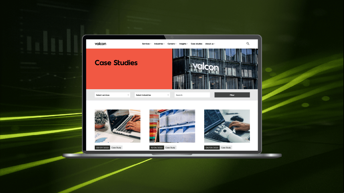
    Designing for speed isn’t about restraint. It’s about alignment – where technical excellence and user experience pull in the same direction. When a site is both fast and intuitive, like Valcon, the brand feels confident, the message lands cleanly, and users don’t notice the infrastructure at all. They just get where they need to go. And that’s the whole point.

  • New block interactions in WP 6.8

    New block interactions in WP 6.8

    New block interactions in WordPress 6.8

    WordPress continues to evolve from a simple blogging tool into a fully-fledged website design and development platform. With each new release, the block editor (Gutenberg) gains features that move it closer to a complete design system. WordPress 6.8 introduces a host of new block interactions that reshape how creators build, manage, and enhance their websites. These changes reduce reliance on custom code, improve usability, and open doors for richer, more dynamic site experiences.

    In this article, we’ll explore the major updates to block interactions in WordPress 6.8, why they matter, and how you can make the most of them in your workflow.


    What are block interactions?

    Block interactions refer to the ways users can manipulate and customise blocks – the fundamental building elements of modern WordPress. From text and images to forms and dynamic layouts, every element on a page is a block. Interactions determine how you move, configure, animate, or integrate these blocks with others.

    In earlier versions of WordPress, block editing was powerful but sometimes clunky. Common tasks like rearranging layouts or styling specific elements required external CSS or plugins. With WordPress 6.8, these pain points are being addressed, making block editing more seamless and intuitive.


    Key features of block interactions in WP 6.8

    1. Advanced drag-and-drop

    The drag-and-drop interface has been completely overhauled. Instead of awkwardly shifting blocks, users can now snap elements into grid-based layouts or nest blocks fluidly within containers. This makes it easier to create magazine-style pages, complex portfolios, or responsive layouts without struggling with alignment.

    Why it matters: Non-technical users gain confidence when layouts behave predictably. Developers spend less time fixing broken structures.

    What our Design team say:

    “As a designer, I see WordPress 6.8 as a big step forward in reducing the gap between vision and execution. Before, I’d hand over static mockups and cross my fingers that the build matched my intent. Now, with contextual editing and block-level animations, I can shape the experience directly. It’s closer to designing in Figma, but the output is a live website. My only concern is that with more tools in the hands of non-designers, consistency might slip – but with proper design systems in place, this release is a win for creativity and speed.”


    2. Contextual settings panels

    Previously, editing a block’s properties often meant navigating sidebars or menus. In WordPress 6.8, contextual settings appear right where you’re working. Hovering over a block reveals inline controls for margins, typography, colours, and more.

    Benefit: This reduces friction in the editing process, cutting down the time between design ideas and execution. It feels closer to professional design tools like Figma or Sketch, but with the power of a live website.


    3. Block-level animations

    For the first time, WordPress introduces native animation options for blocks. Users can apply fades, slides, and subtle motion effects directly from the editor. Previously, this required third-party plugins or JavaScript knowledge.

    Example use cases:

    • Fade-in text for blog intros.
    • Sliding image galleries for portfolios.
    • Animated call-to-action buttons to boost conversions.

    SEO note: Google increasingly values user experience signals, including interactivity. Smooth animations can improve engagement metrics like time-on-page.


    4. Enhanced nesting and grouping

    Complex designs often require blocks within blocks. WordPress 6.8 makes this process smoother with enhanced nesting support. For example, you can now create a multi-column layout inside a card, within a grid – without breaking the design.

    This mirrors how developers structure HTML containers but translates it into a visual, no-code environment.


    5. Developer APIs for custom interactions

    For advanced users, new APIs allow developers to define custom block interactions. This means plugin and theme developers can build blocks with specialised behaviours that match brand or business needs.

    Examples:

    • A custom product showcase block for eCommerce sites.
    • Interactive data visualisations for reports.
    • Drag-to-compare image sliders for case studies.

    What our Dev team say:

    “From a developer’s perspective, these updates are a mixed bag – in a good way. On one hand, the new APIs for custom interactions are great because they let us extend WordPress without hacking things together. On the other, the more that gets baked into core, the more I need to keep an eye on performance and plugin compatibility. I like that clients can now handle simple layout tweaks without pinging me for every change, but I also know I’ll be the one troubleshooting when someone adds twenty animated blocks on a page. Overall, though, it’s progress.”


    Why these updates matter

    Democratising web design

    WordPress has always aimed to democratise publishing. With these updates, it now democratises design. Non-coders can craft sophisticated experiences without outsourcing everything to a developer.

    Faster prototyping

    Design teams can use WordPress itself as a prototyping tool, reducing the need for constant back-and-forth between design and development teams. What you design is what you publish.

    Consistency across devices

    Improved responsiveness and nested structures mean fewer design breakages across desktop, tablet, and mobile.


    How to use block interactions in your workflow

    Step 1: Explore the new editor

    Take time to experiment in a staging environment. Familiarise yourself with the updated controls, especially inline settings and animations.

    Step 2: Redesign a key page

    Choose a high-traffic page (like your homepage or a product landing page) and rework it using the new features. Track engagement changes in analytics.

    Step 3: Train your team

    If you work in an agency or organisation, run a short training session. Show non-technical team members how they can update layouts without developer input.

    Step 4: Extend with plugins

    Check if your favourite plugins have been updated to leverage the new APIs. Many will offer extended animation or interaction libraries.


    Potential challenges

    Learning curve

    Although easier overall, the sheer number of options may overwhelm beginners. Clear tutorials and templates will help.

    Compatibility issues

    Older themes or plugins may not support advanced nesting or animations. Test thoroughly before pushing changes live.

    Performance Considerations

    Animations and complex layouts can affect site speed if overused. Balance aesthetics with performance.


    The future of WordPress design

    WordPress 6.8 isn’t just another incremental update. It signals a shift towards WordPress becoming a true design platform. Over the next few years, we can expect even tighter integration with design tools, AI-assisted layout suggestions, and more interactive features built directly into the editor.

    For designers and developers, this means fewer silos. For businesses, it means faster, more cost-effective site management.


    Conclusion

    The new block interactions in WordPress 6.8 make site building more intuitive, flexible, and powerful. Whether you’re a solo blogger, a creative agency, or a large enterprise, these features can streamline workflows and open up fresh design possibilities.

    Now is the time to explore, experiment, and embrace these changes — because WordPress is no longer just about publishing content; it’s about designing experiences.