
Is it time to break up with your website?
People are easily turned off from websites these days as a host of issues like slow loading times, intrusive pop-ups, confusing navigation and broken links leave many quickly clicking away.
For businesses using their website to showcase their services, these problems – or browser “icks” – can be the difference between a prospective customer exploring an online platform with ease or swiftly closing an overloaded tab without realising its full potential.
Many businesses, especially those who have been in the game for a long time, often go months or years without giving their website a much-needed overhaul.
The result? An out-of-date website where a company’s hard work is buried and lost under a cluttered page layout, auto-playing videos or excessive ads.
If you’ve fallen out of love with your website, or you fear your customers are getting the “ick” from your platform, don’t fret. We seek to outline the biggest problems businesses are making with their site and the easiest ways to fix them.
Run a quick vibe check and see if your site’s turning heads.
The most common and overlooked website “icks” – and how they cause real problems for businesses
Many of the biggest problems with websites aren’t dramatic or obvious – they’re small friction points that quietly frustrate users and push them away. Over time, these “icks” add up, affecting how long people stay on a site, how much they trust it, and whether they take action.
Some of the most common and overlooked issues include neglecting to build trust and legitimacy, preventing people from breathing while checking out a site and displaying information with disorganisation and a lack of clarity.
These problems can cause real problems for businesses, and here’s how:
Vague and shallow homepages
Users can click away from a site and its services if they can’t instantly place it – and a homepage containing hollow, empty language is a quick way to kill trust and attention.
Making a first impression is very important, and users will click off a site and find another one if they’re not instantly convinced to explore further.
Slow loading times
Pages that take too long to load test patience immediately and users are far less likely to engage with the content or delve into a company’s services if a site feels sluggish from the outset.
Studies show the average attention span is gradually reducing and if you’re struggling to reel someone in within a few minutes, it’s highly likely a prospective customer will bounce and take their business elsewhere.
Confusing or unclear navigation
Overloaded menus, vague labels or poorly structured pages make it difficult for users to find key information. When people can’t quickly locate what they need, they tend to leave.
It’s also worth noting that a website acts as a mirror for a business – so including mess and disorganisation can reflect negatively on a company and its services.
Poor mobile responsiveness
Websites that don’t adapt properly to smaller screens – with broken layouts, hard-to-read text or awkward buttons – risk alienating mobile users.
These days, many people opt to browse the internet on their phones rather than a laptop or tablet, so a website that fails to cater for most of its visitors will quickly become unpopular.
Cluttered layouts and intrusive elements
Too many pop-ups, banners or auto-playing videos can overwhelm visitors and distract them from the main message.
Stopping people from exploring a site with ease creates a stressful experience, rather than a positive one, prompting many to click away from a page which is too overloaded.
Unclear calls to action
If users don’t know what to do next, they’re unlikely to take any action at all. Websites that fail to highlight whether someone should get in touch, learn more or make a purchase risk losing prospective customers with this lack of direction.
Outdated or low-quality content
Old information, generic messaging or poorly written copy can make a business feel neglected or out of touch, even if its services are strong.
Neglecting to pay attention to the tone which is presented through the language displayed on a website can also quickly turn off visitors, especially if it comes across as detached and superficial.
Lack of trust signals
Missing reviews, unclear pricing, limited contact details or no evidence of real people behind the business can cause hesitation and suspicion.
Building trust with a new customer is pivotal, and feeding into scepticism by failing to include these markers of credibility can quickly tell people you have no legitimacy – and it’s unlikely users will return to a site where they feel the trust is broken.
How to rekindle the spark
So, what can you do about this? Luckily, we’ve got your back – and we’ve outlined a series of easy changes you can make to ensure your website delivers successfully every time.
For your homepage, we suggest bringing it back to basics with one specific sentence. Inject clarity to ditch any uncertainty. We also advise having one, straightforward call to action, rather than multiple, to provide flow and direction to your online visitors.
Zoom in on the language you’re putting across throughout the pages on your site and evaluate the tone it conveys. Replace any fluff with numbers and examples – and make sure you’re avoiding any disconnected, AI-style vocabulary where possible.
Next, turn your attention to your menu to encourage people to explore your site further. Adding clearer labels, and even a search bar if needed, is a quick and easy way to make your space more user-friendly.
Ensure the pages of a site are simplified and easy-to-read. Remove any distractions, pop-ups, auto-playing elements and clutter to help visitors explore your site with ease and comfort.
It’s also incredibly important to assess the legitimacy of your business by putting yourself in the shoes of your customer. Include real reviews and testimonials, as well as and clear contact details, to allow people to trust in both your site and your services. Putting together a simple ‘Meet the Team’ page also shows users the real faces behind the online space they’re exploring. A picture, a name and a job title for each of your team members is all you need – and it’s a proven way to gain trust authentically.
Ready to kiss and make up?
With technological advancements taking place at rapid speed, it’s easy to feel as though your online platform is constantly going out of date. At Kraam, we know how you feel.
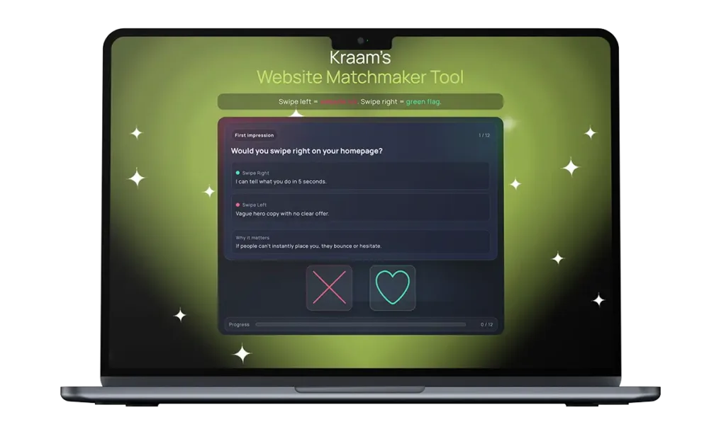
To support businesses looking to make website adjustments, we’ve created an innovative Website Matchmaker Tool designed to help you decide if it’s time to part ways with your site – or if there’s a good foundation to rekindle the spark.
Operating like a dating app, users can swipe left or right on a variety of elements that contribute to an online platform – where right is a green flag but left is an “ick”.
Users are given a chemistry score out of 100 at the end to see how their site is fairing – and for those in trouble, we’ve highlighted a series of quick fixes so both you and your customers can fall back in love with your platform.
Matthew Jeffers, Kraam’s website relationship guru, said:
“If your website gives ‘it’s complicated’ vibes and your menu reads like a Chinese takeaway, with zero trust signals and stock-photo clone energy, it’s not quirky – it’s why leads are ghosting you.”
“Our Website Matchmaker Tool will tell you whether to swipe right, swipe left or book your site in for some relationship counselling so we can bring the spark back.”
To find out more about our services, please get in touch here.